The 3DS box was tiny and white-edged, and most of its covers played it safe. These ten did not.
10. The Legend of Legacy (2015)
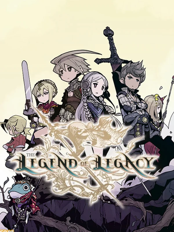
The cast stands in muted greys and browns on a cream page, with a huge sword planted behind them and a scaly fish-man crouching at the front. It looks like a sketch lifted from an art book, and nothing else on the shelf looked like it.
9. The Legend of Zelda: A Link Between Worlds (2013)
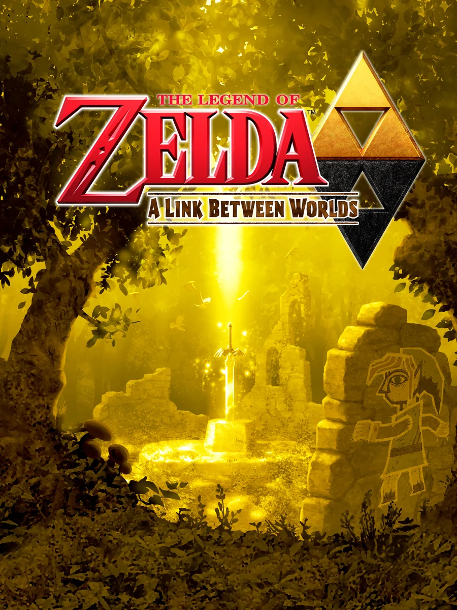
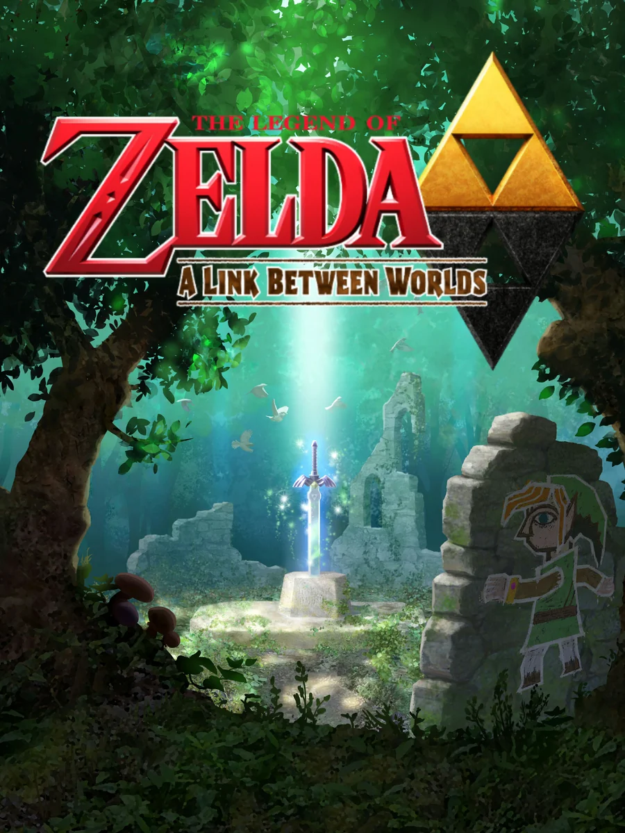
A beam of golden light falls on the Master Sword in a forest ruin, and Link appears as a flat drawing on the stone wall beside it. That drawing is the game's big trick, since a magic bracelet lets him merge into walls as a 2D painting. Europe and Japan, meanwhile, got the same scene washed in green instead of gold.
8. Sega 3D Classics Collection (2015)
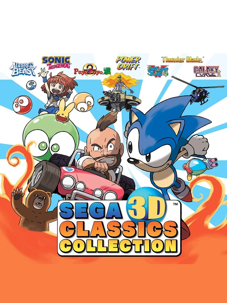
Sonic shares a bright orange box with a cheerful crowd of old Sega faces, all drawn in a clean cartoon style. It is the friendliest cover on this list. In fact, it might be the best cover art of any Sega compilation, possibly even topping the Saturn's Sega Ages release.
7. Rhythm Heaven Megamix (2015)
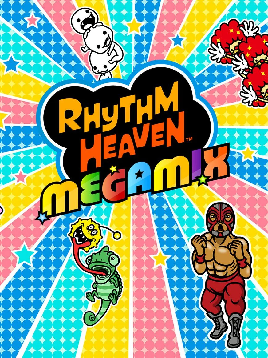
Rays of every colour burst out from the logo, while a masked wrestler and a chameleon strike poses around it. Like the game, it is impossible to look at without smiling.
6. Zero Escape: Virtue's Last Reward (2012)
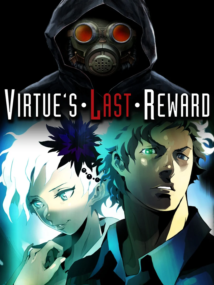
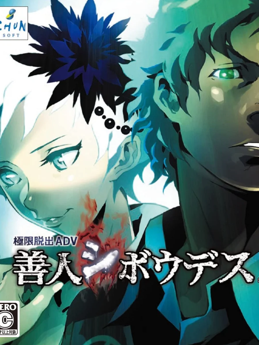
A hooded figure in a gas mask looms over the hero's face, both lit in a cold, sickly blue. It is genuinely unsettling, which suits a game about being trapped and forced to play a deadly game. Japan's box, by contrast, is a tight close-up of two faces in icy cyan with the title splashed in red.
5. Shin Megami Tensei IV (2013)
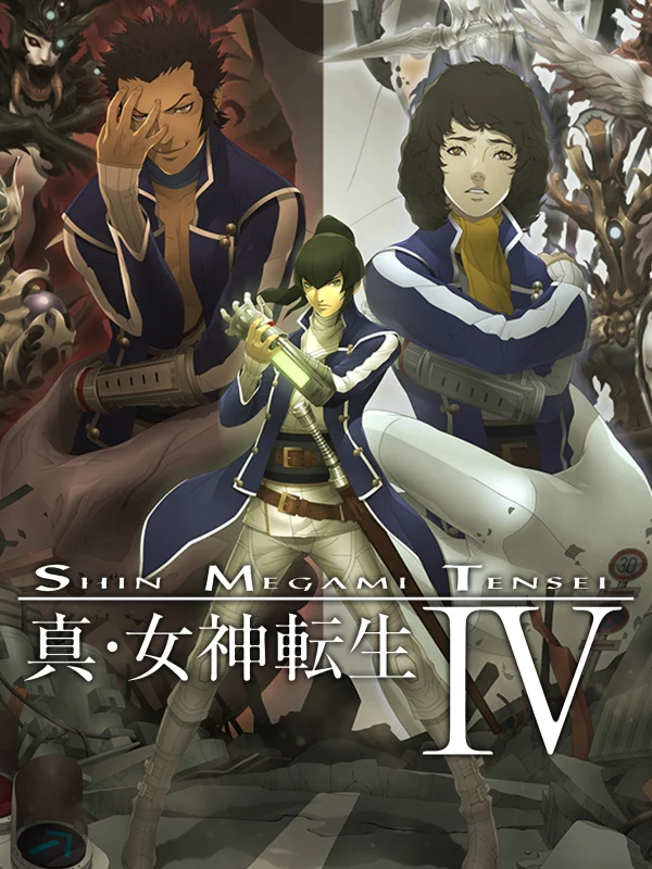
The cast stands in a column of long samurai coats, painted in dusty browns, with the hero calm at the front and a demon lurking at the top. The main characters were designed by Masayuki Doi, and the box treats his work like a museum portrait.
4. Etrian Odyssey Untold: The Millennium Girl (2013)
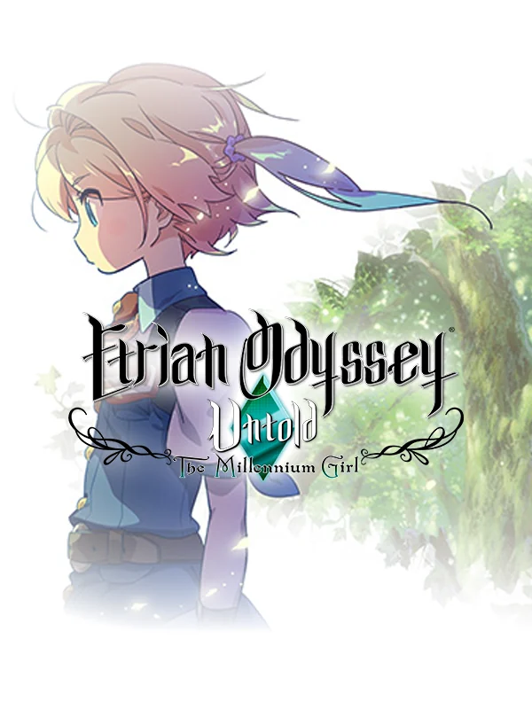
A pale girl with pink and blond hair looks down in profile on an almost empty white box, with the logo written in thin, curling ink. There is barely anything there, and it is gorgeous.
3. The Legend of Zelda: Majora's Mask 3D (2015)
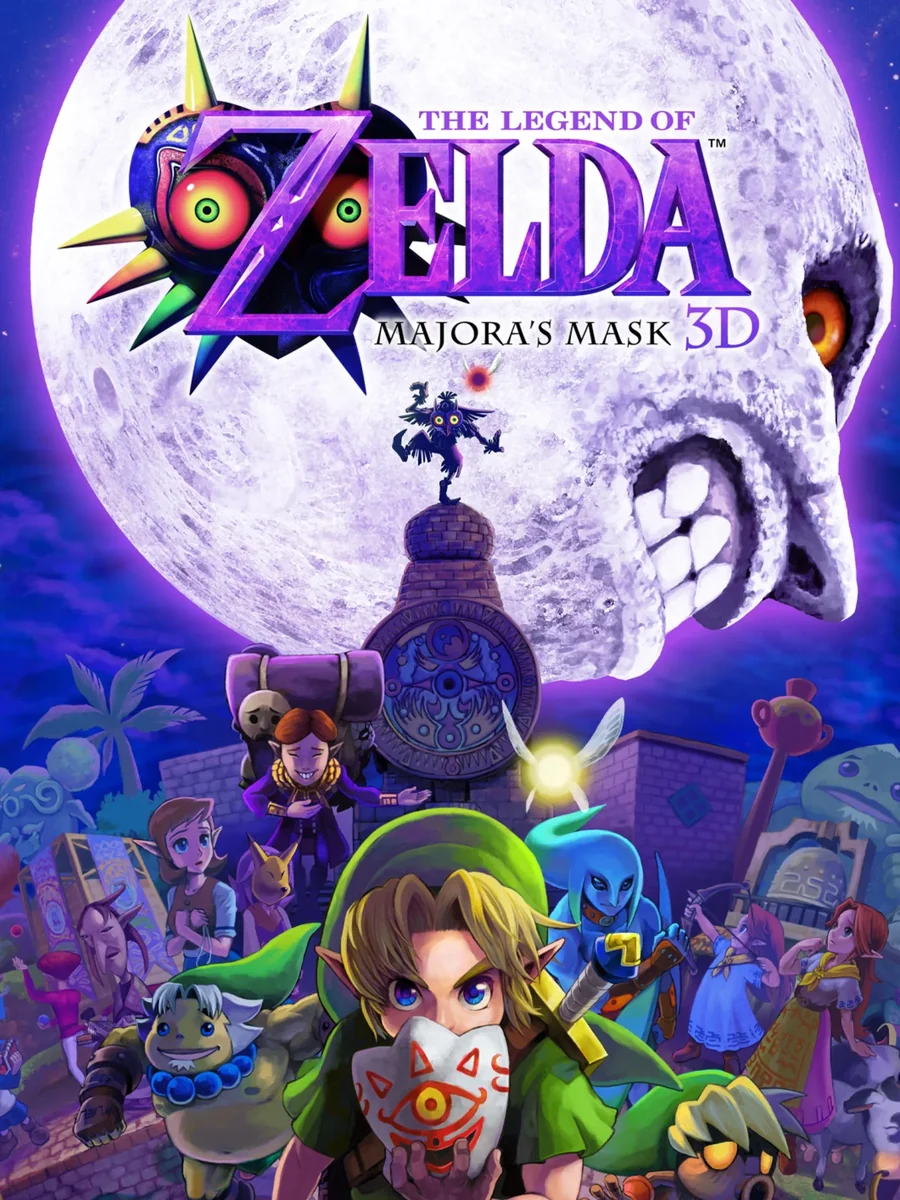
The moon fills the top half of the box, purple and grinning, while Link stands below in Clock Town and a tiny figure perches on the clock tower. Honestly, the cover art on this release is phenomenal. It makes a creepy game look as creepy as it really is.
2. Bravely Default: Flying Fairy (2012)
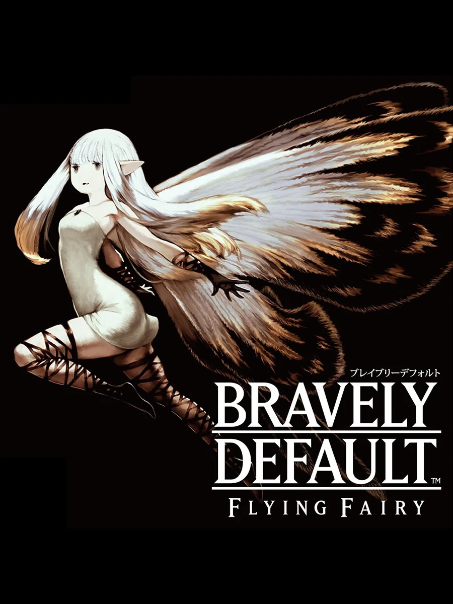
A pale winged woman drifts across a pitch-black box, her feathered wings spread wide, with nothing but thin white type beside her. The art director was Akihiko Yoshida, and the box shows off his work with no clutter at all.
1. Fire Emblem Awakening (2012)
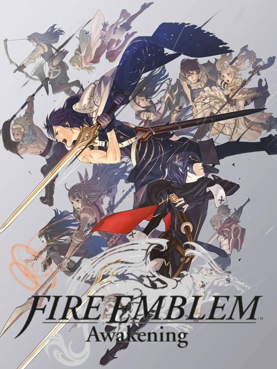
The whole army pours down the box in a rush of ink-wash grey, with Chrom lunging out in front, sword first. It feels like a battle frozen mid-charge. Fittingly, the artist Yūsuke Kozaki was brought in to create a distinctive art style that would be well received overseas, and the cover alone proves the plan worked.
The other side of the shelf: the worst Nintendo 3DS box art.