The PS2 sold more games than any console before it, so a cover had to work hard to stand out in that black plastic crowd. These ten managed it.
10. R-Type Final (2003)
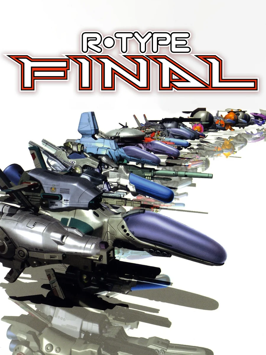
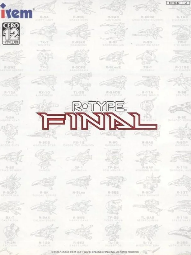
Dozens of ships line up in a long diagonal formation, from tiny fighters to huge cruisers, all heading off the edge of the box. That is no accident, since the game's big claim to fame, as the cover shows, is the absurd number of ships you get to pilot. Japan's box, on the other hand, is white, with ship blueprints traced faintly across it.
9. Persona 3 (2006)
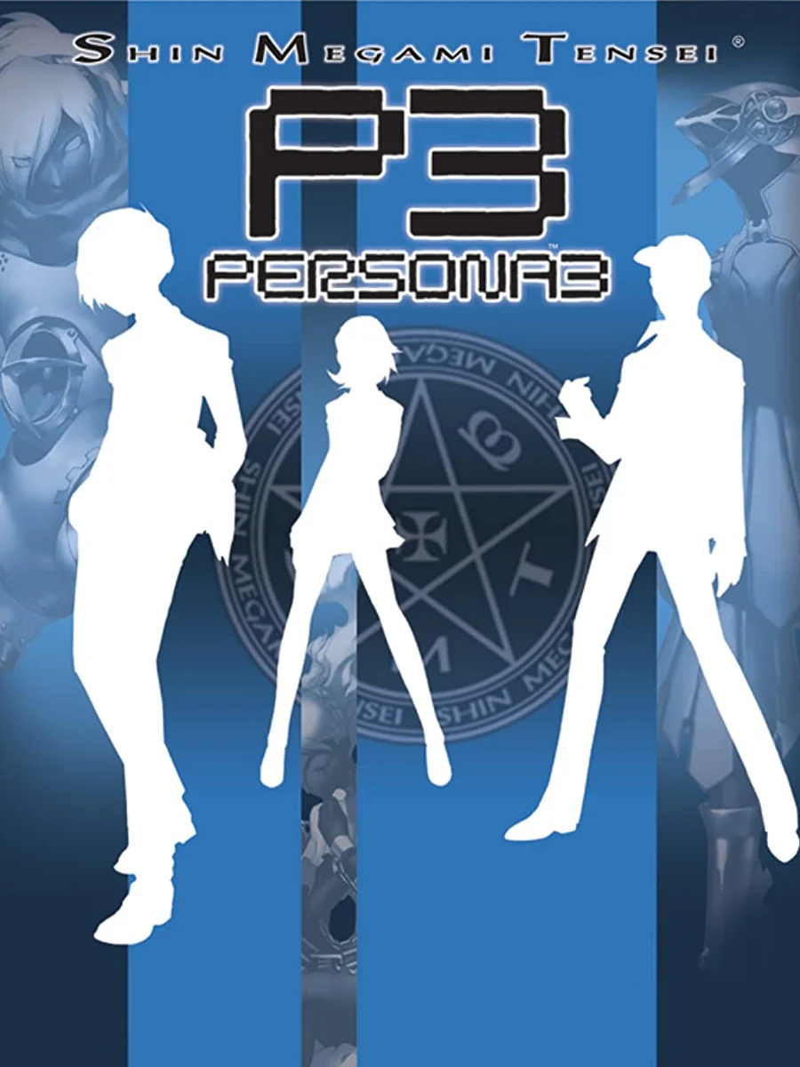
The cast appears as plain white silhouettes against a deep blue box, posed under a small summoning circle. There are no faces at all, which is a bold choice for a game about its characters. The art director was Shigenori Soejima, and the restraint makes the box feel as cool as the game.
8. Metal Gear Solid 3: Snake Eater (2004)
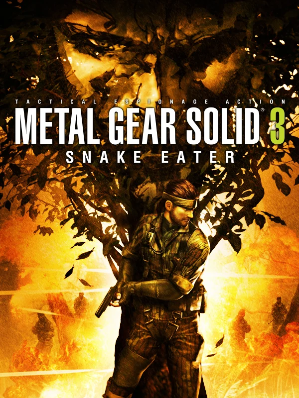
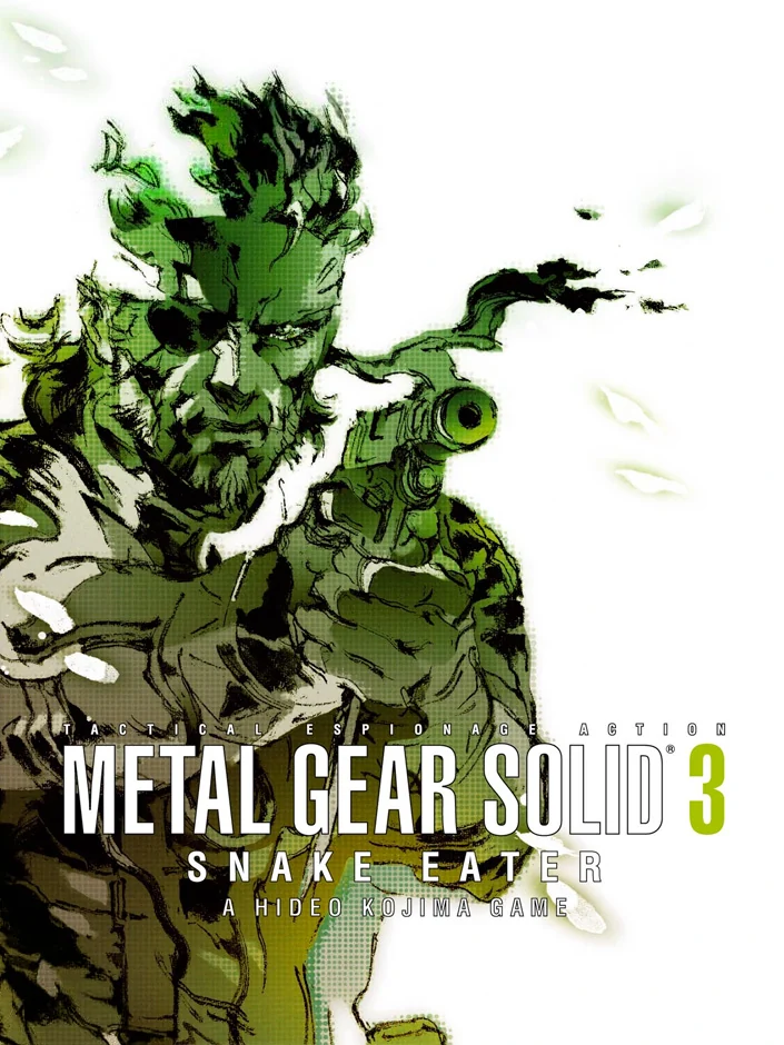
In Europe, Snake crouches in a cloud of green camouflage brushstrokes on a white box, so he almost melts into the paint. That suits a game that introduced camouflage to the series. The American box, by contrast, is a busy golden collage that looks like a war film poster.
7. Rez (2001)

A glowing figure floats in front of a burst of red and gold light over a wireframe grid, with the logo in thin orange letters. It looks like the moment a rave turns into a religious experience. The game drew on rave culture, so the box is pretty much a promise kept.
6. Killer7 (2005)
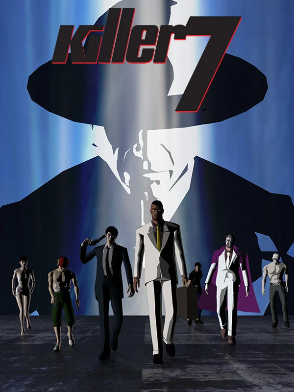
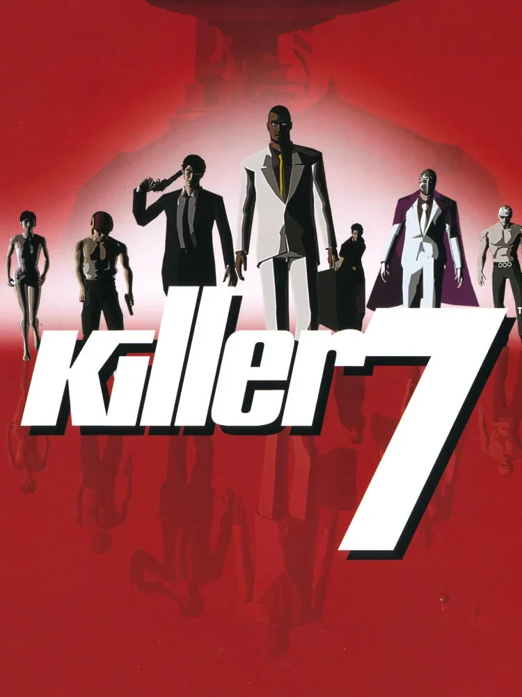
The American box shows a man in a wide-brimmed hat looming over a row of figures walking out of a blue light. Europe's box, meanwhile, lines the seven killers up in their suits against a blood red background. Both look like the cover of a crime comic, which fits the first game Goichi Suda released outside Japan.
5. God Hand (2006)
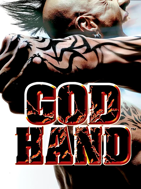
A tattooed arm clenches into a fist across the whole box, under a bold black and red logo. It says everything about the game in one image. As one review put it, this is one of the few cases where Americans got the better artwork.
4. Ōkami (2006)
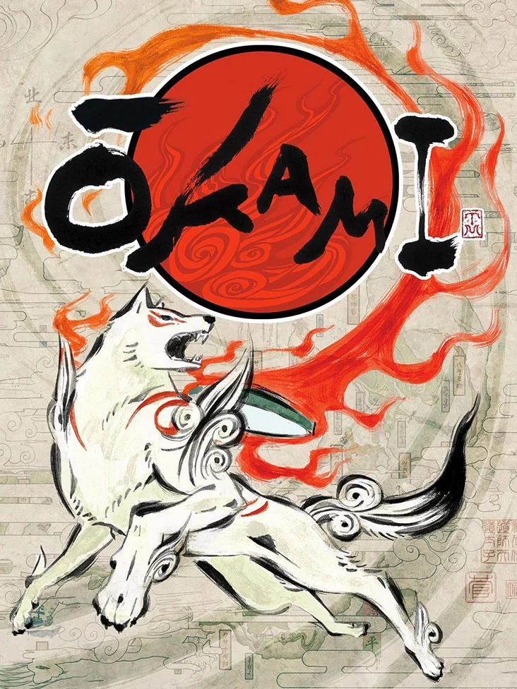
The white wolf Amaterasu runs across an old paper scroll, painted in brushstrokes with flames of red curling around her. The game itself looks like an animated Japanese ink painting, so the box shows you the real thing.
3. Katamari Damacy (2004)
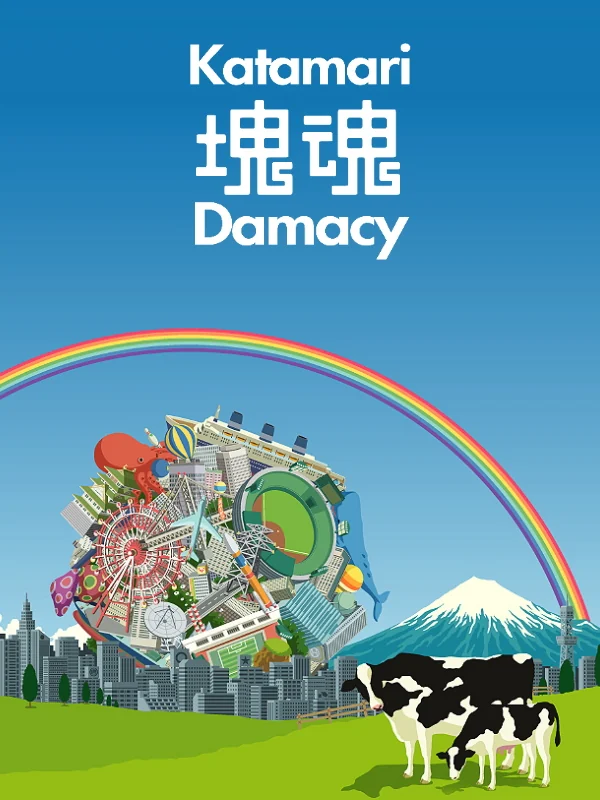
A huge ball of junk rolls toward a city under a rainbow, while cows graze in the foreground. The designer Keita Takahashi made the cover himself, showing a katamari about to roll over a city to get the scale of the game across. It is the happiest box on the system, and also the strangest.
2. Shadow of the Colossus (2005)
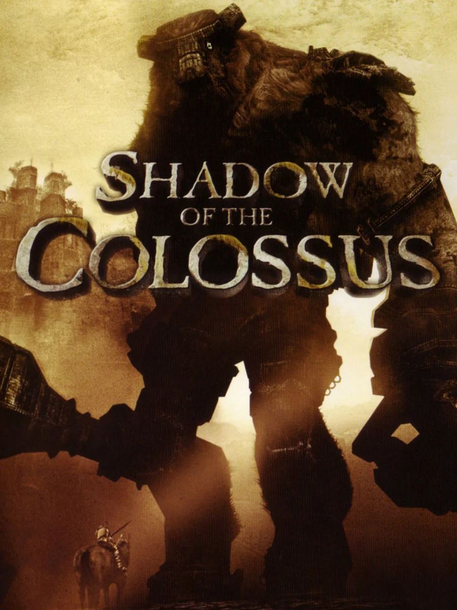
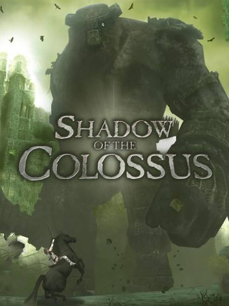
The American box is a sepia silhouette of a colossus with the tiny hero standing below. Europe's box, by comparison, shows the giant stomping through a green, misty plain, so big that it barely fits. Both are gorgeous, and both make you feel very small.
1. Ico (2001)
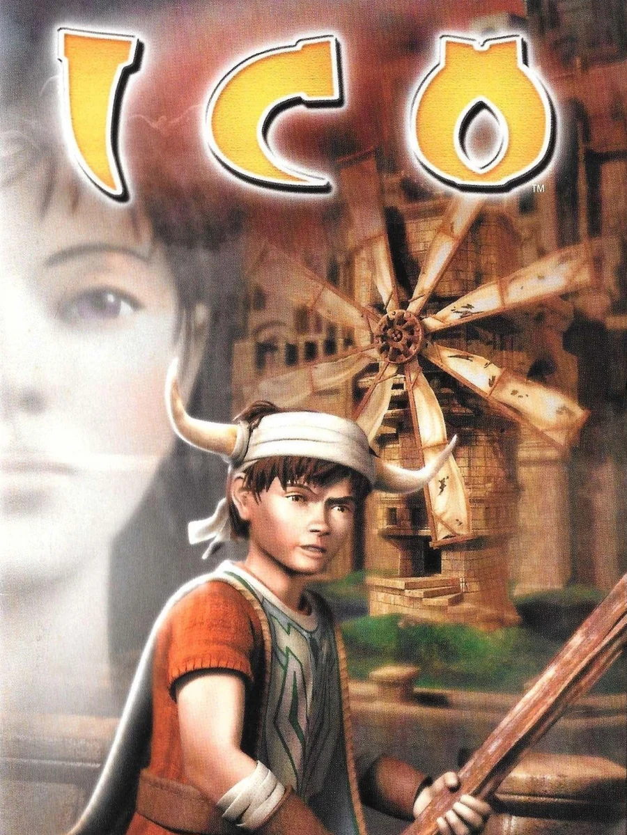
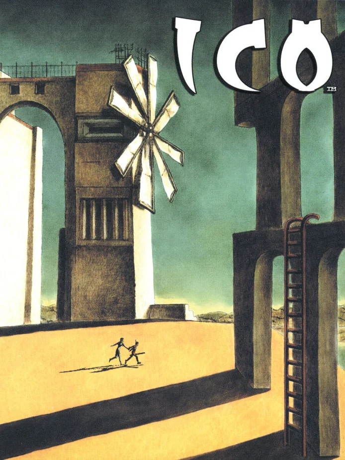
In Europe and Japan, two tiny figures run hand in hand across a sunlit courtyard under enormous stone arches and a windmill. The painting is by the game's director, Fumito Ueda, and it was inspired by Giorgio de Chirico's The Nostalgia of the Infinite. The American box, on the other hand, swaps it for a stiff 3D render of the boy in front of the logo, and it is one of the great missed chances in box art.
The other side of the shelf: the worst PS2 box art.