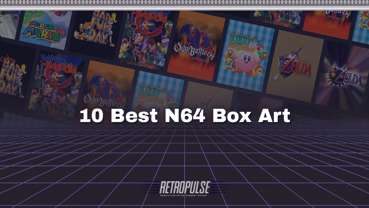
The N64 box was big, chunky cardboard, which gave the artwork plenty of room. These ten used every inch.
10. Kirby 64: The Crystal Shards (2000)
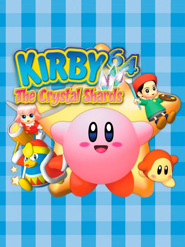
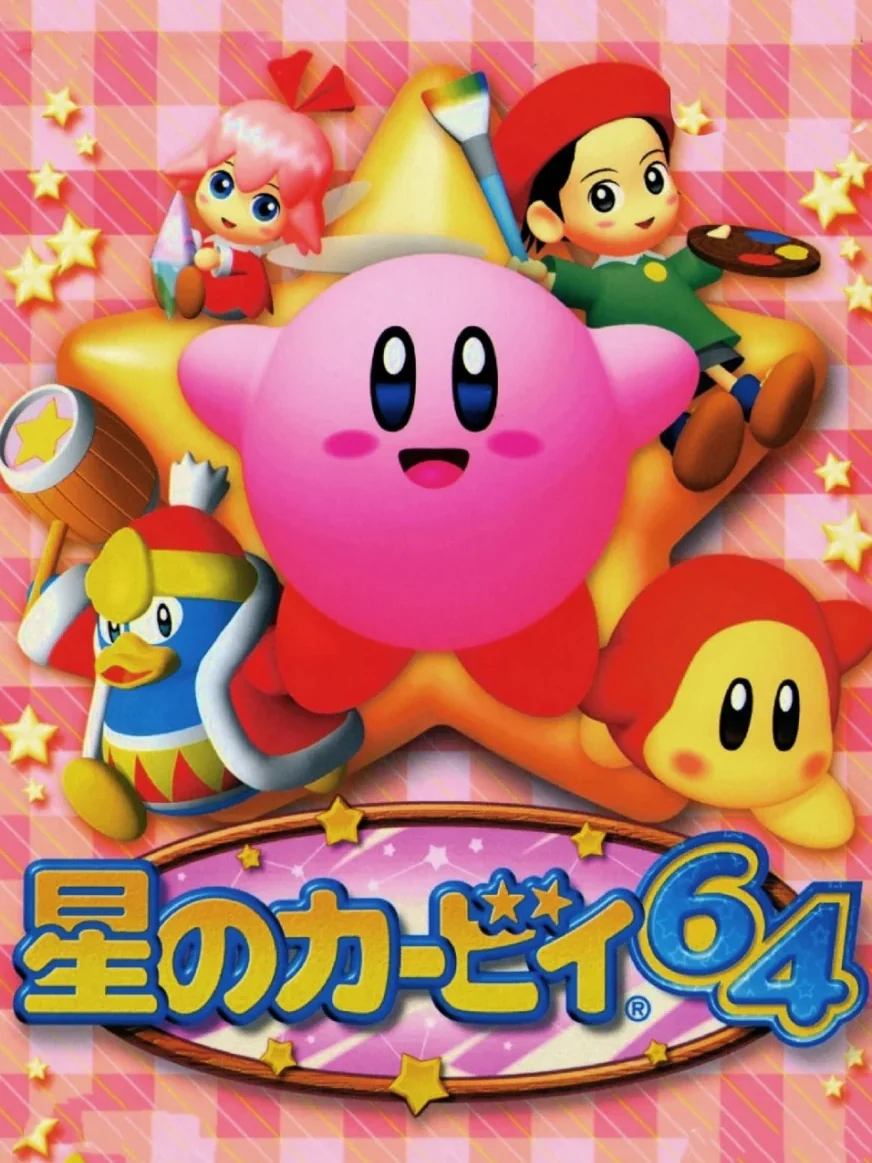
Kirby and his friends float on a blue gingham background, as if someone laid out a picnic cloth and a bunch of cartoon characters landed on it. Japan's box, meanwhile, swaps the blue for pink and puts Kirby on a star. Either way, it is impossible to look at without wanting a sandwich.
9. Ogre Battle 64 (1999)
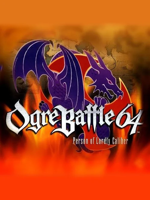
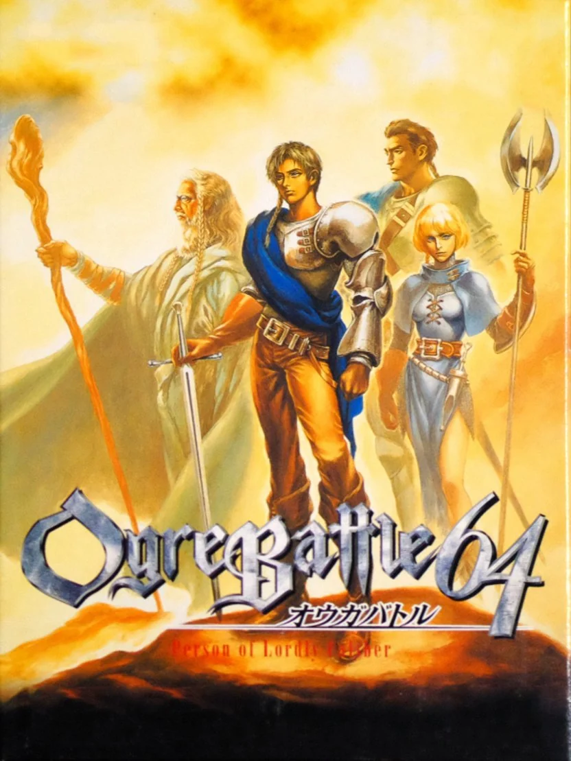
A purple dragon spreads its wings over a wall of fire on the American box, under a silver logo. Japan's box, by contrast, is a soft painting of knights and mages bathed in golden light, like the cover of a fantasy novel.
8. Banjo-Kazooie (1998)
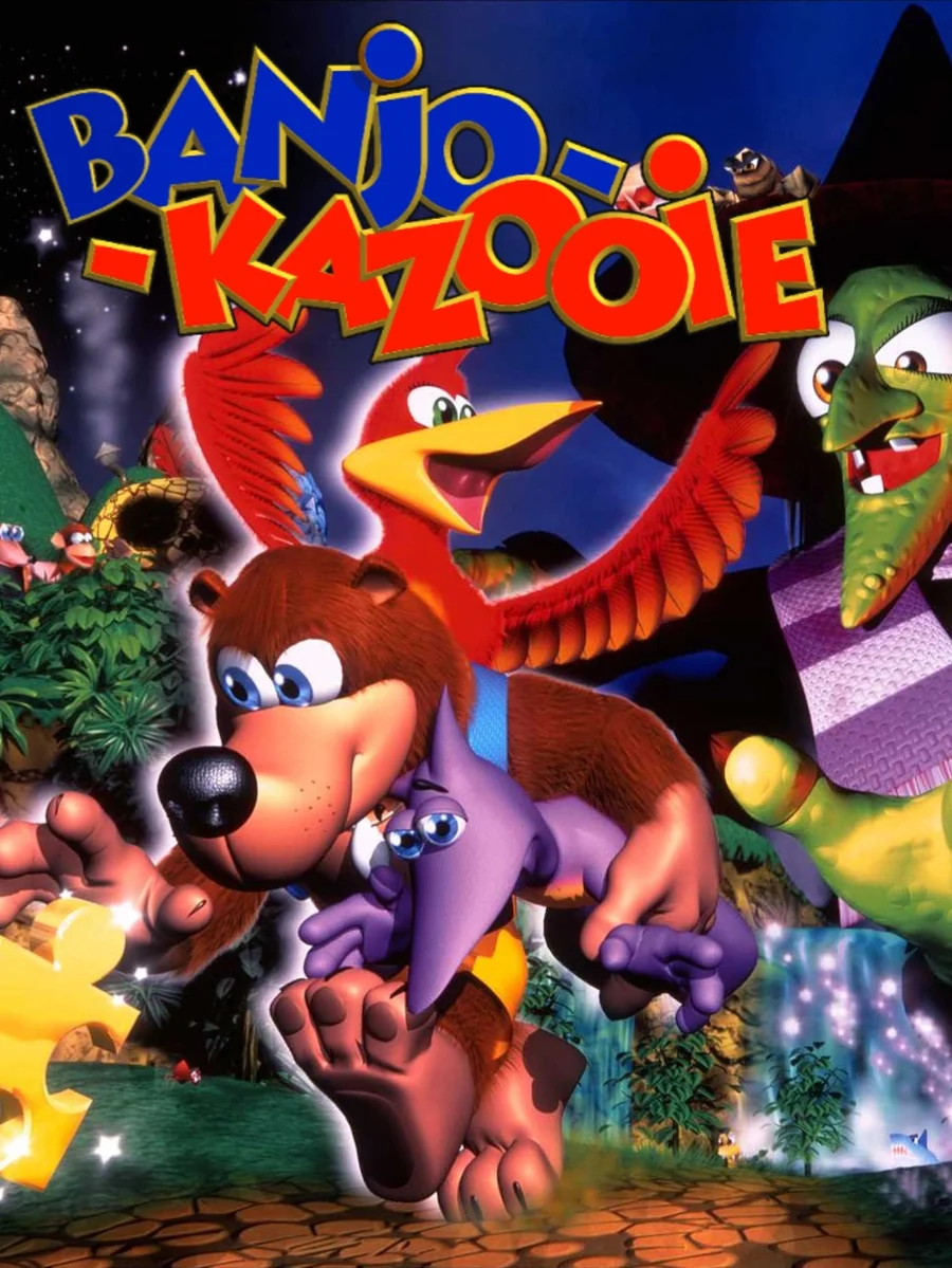
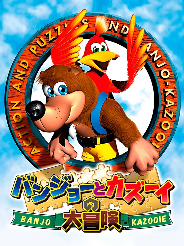
Banjo charges out of the dark with Kazooie poking out of his backpack, both grinning like they know something you don't. Japan's box, on the other hand, frames the pair inside a ring of lettering, like a badge.
7. Conker's Bad Fur Day (2001)

Conker leans against giant orange letters on a pitch-black box, drink in hand, while his girlfriend sits on top of the logo. It looks like a cute platformer, but the black background gives the game away. It began life as a family game called Twelve Tales: Conker 64 before it was turned into a game for mature audiences.
6. Super Mario 64 (1996)
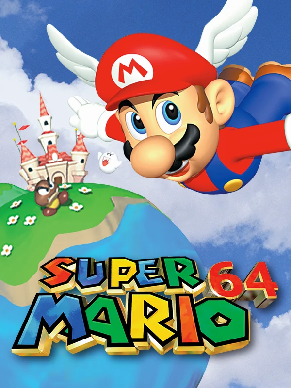
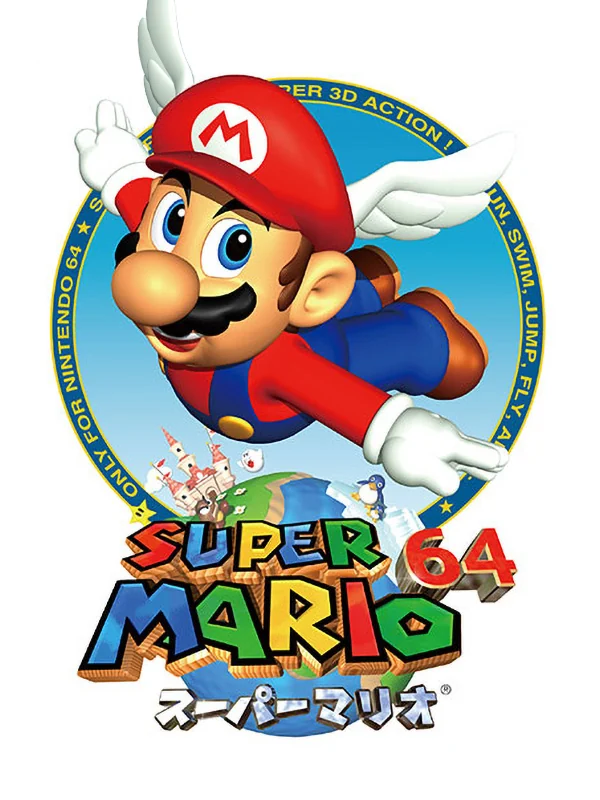
Mario flies at you with his wing cap on, over the castle and a curve of blue sky, with the logo sitting at the bottom. It is bright and full of movement, which is exactly what the game felt like. Japan's box, by comparison, puts the same Mario inside a round emblem.
5. Star Fox 64 (1997)
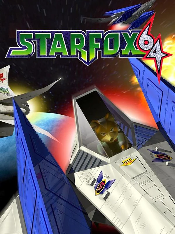
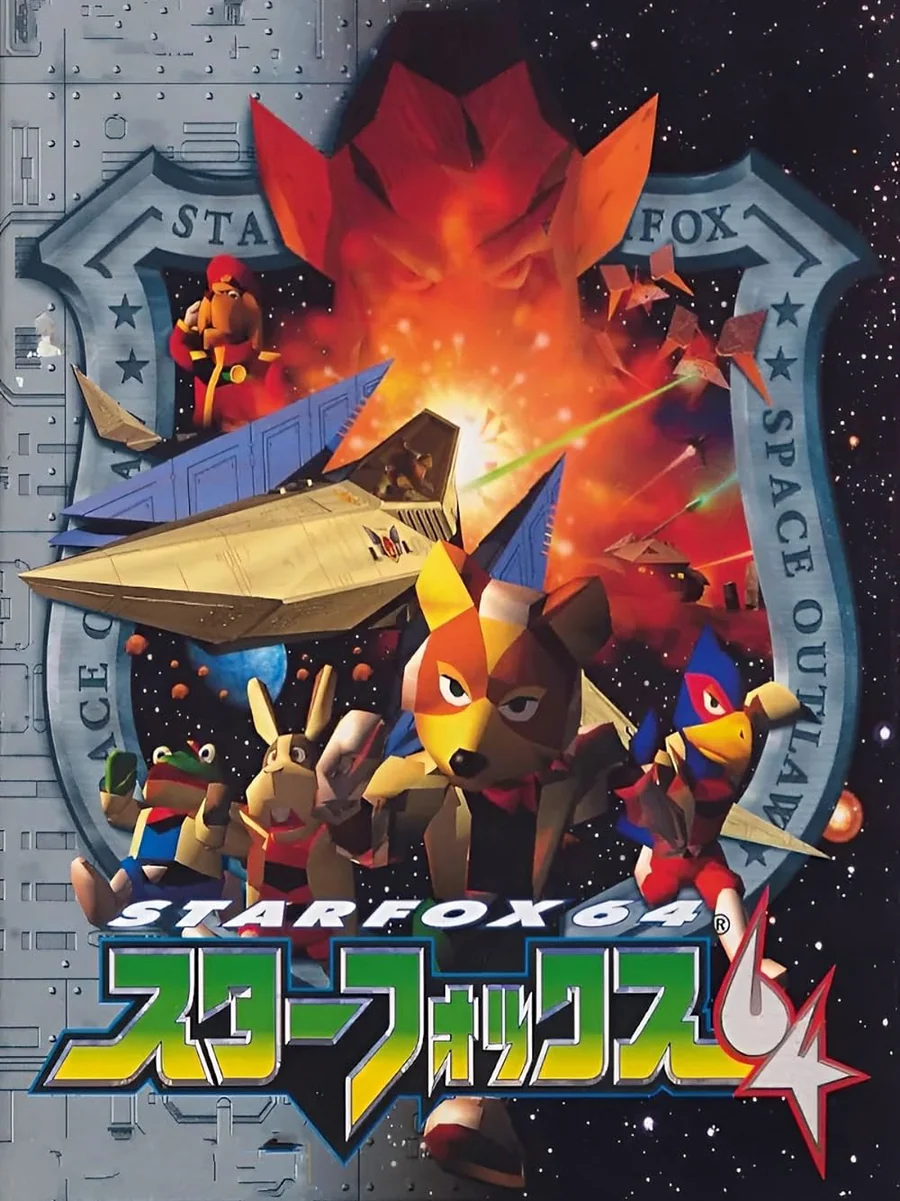
Japan's box looks like an old war poster: Fox and his team pose in front of a fiery explosion, inside a frame stamped with the logo. The American box, on the other hand, shows an Arwing banking through space, which is fine but much less fun. The game was also the first on the N64 to support the Rumble Pak.
4. Sin and Punishment (2000)
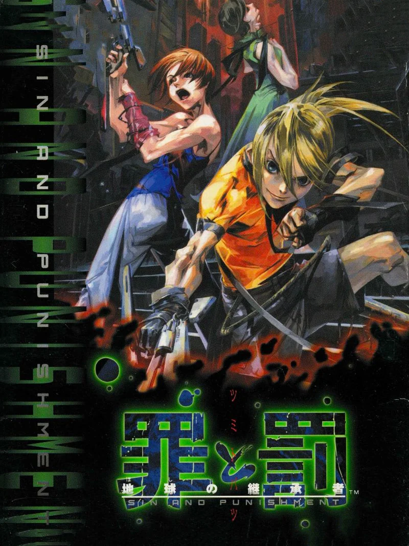
The two heroes stand painted in sharp, gritty detail beside a column of glowing green text, with the kanji title at the bottom. It looks like the cover of a cult anime. The game came out exclusively in Japan, and the rest of the world only got it years later on the Wii Virtual Console.
3. Perfect Dark (2000)
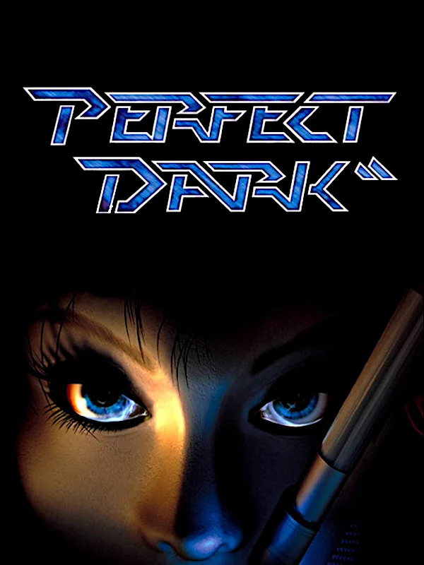
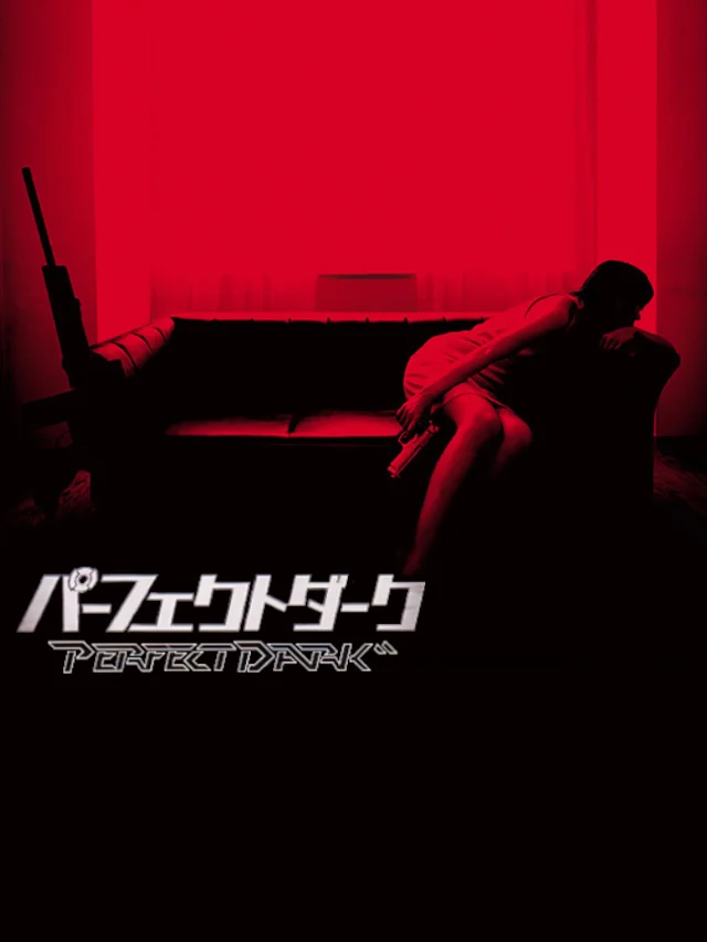
Two blue eyes stare out of a black box under a thin, glowing logo, and that is all you see of Joanna Dark. It is a great choice for a spy game, and for the spiritual successor to GoldenEye 007. Japan's box, by contrast, is a dark red room with a figure lying in the shadows.
2. The Legend of Zelda: Majora's Mask (2000)
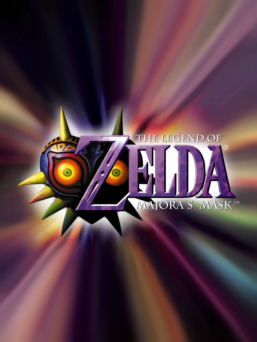
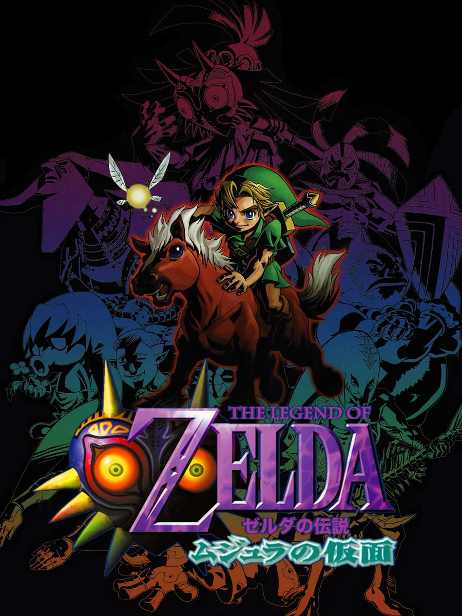
The mask sits in the middle of a burst of psychedelic light on the American box, staring straight at you. Japan's box, meanwhile, is a dark painting of Link and the Skull Kid in a gloomy purple world. Both feel wrong in the right way for a game about stopping the moon from crashing in three days.
1. The Legend of Zelda: Ocarina of Time (1998)
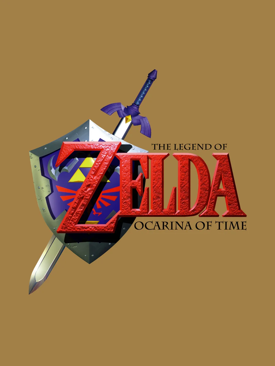
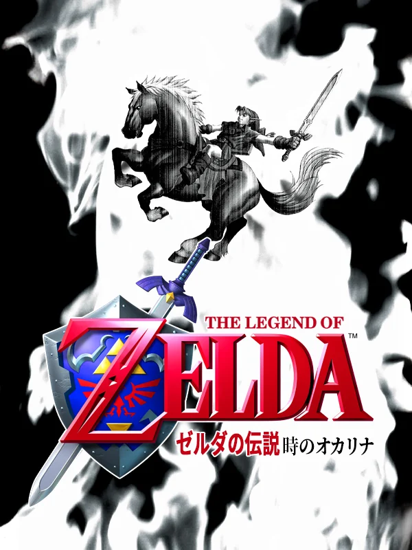
Japan's box shows Link riding Epona mid-leap with his sword raised, painted in black and white brush strokes across a white page. The American box, on the other hand, is a gold shield on a gold background. That one is a classic in its own way, but the Japanese painting is the cover that belongs in a museum.
The other side of the shelf: the worst N64 box art.