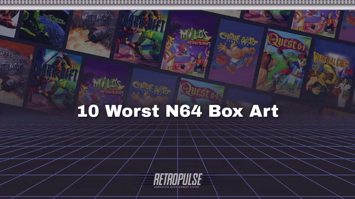
N64 games cost a fortune, so the box had to make the case. These ten made it badly.
10. Charlie Blast's Territory (1999)
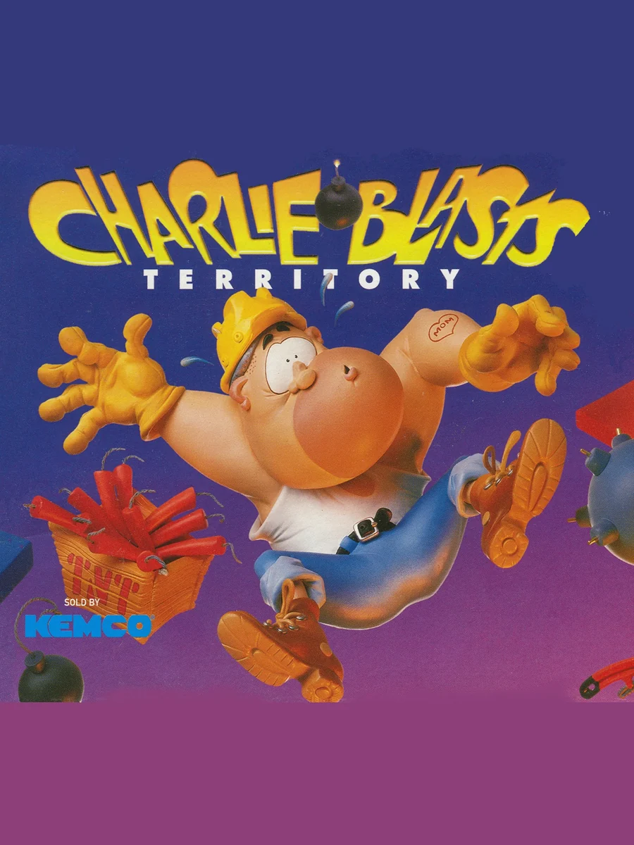
A chubby demolition man in a hard hat floats across a flat purple background, with a few bombs drifting around him. There is no scenery and no sense of what the game is.
9. Milo's Astro Lanes (1998)
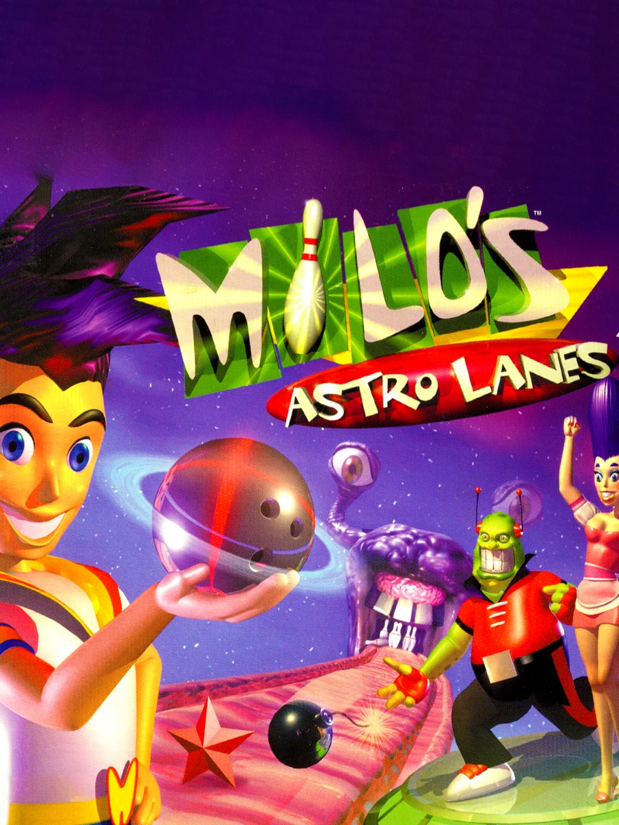
A grinning bowler holds a ringed planet for a ball while an alien in a cape lurks behind him on a pink and purple lane in space. It is bowling in space, and somehow the box still manages to look boring.
8. Dark Rift (1997)
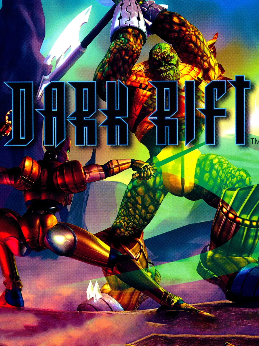
Murky 3D fighters claw at each other behind a logo so dark and jagged that you have to squint to read it. It looks like a screenshot rather than a cover.
7. Chopper Attack (1997)
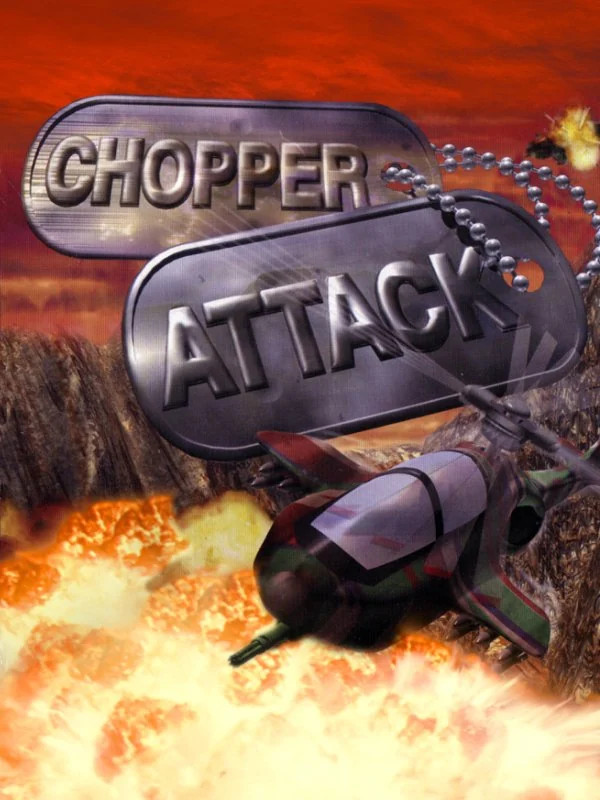
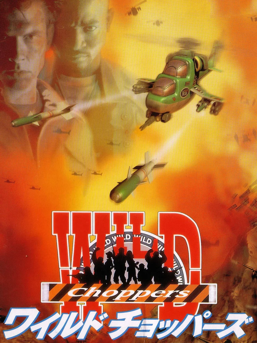
A chrome logo shaped like a dog tag hangs over a smudge of orange explosion, with a helicopter barely visible underneath. Japan's box, where the game is called Wild Choppers, at least shows soldiers and helicopters you can actually see.
6. War Gods (1995)
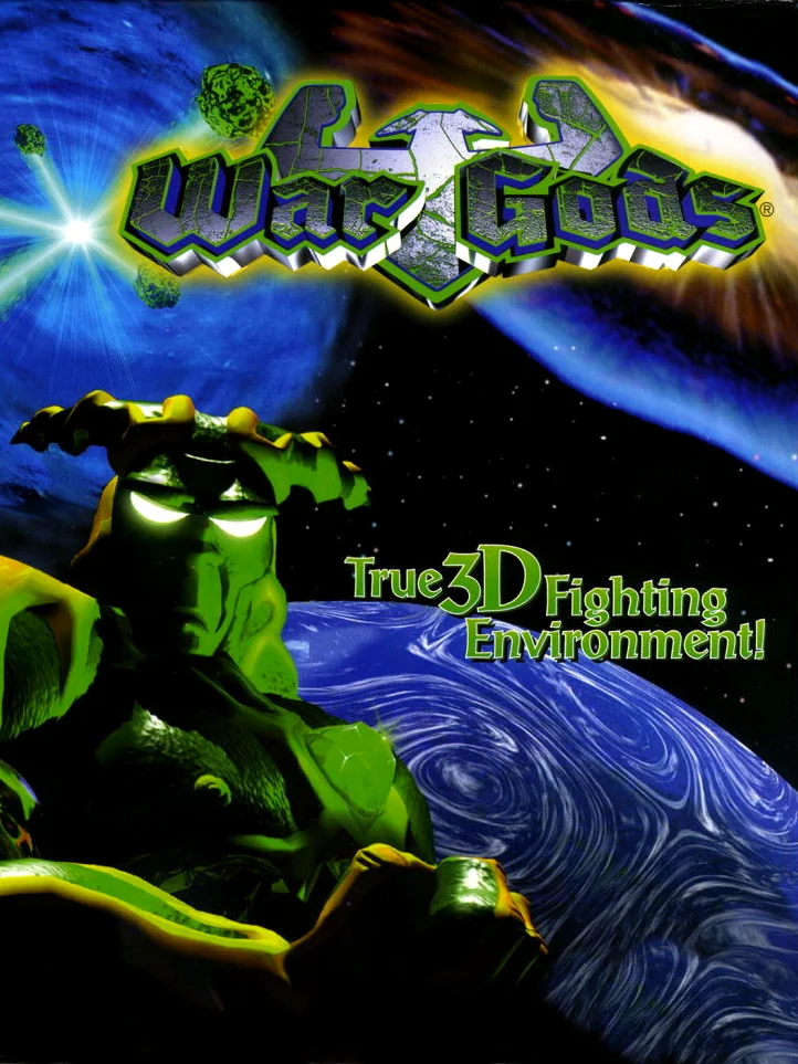
A green monster hovers over a swirl of blue planet, next to a tagline promising a true 3D fighting environment. It is a box that brags about the technology, because the art has nothing else to say.
5. Carmageddon 64 (1999)
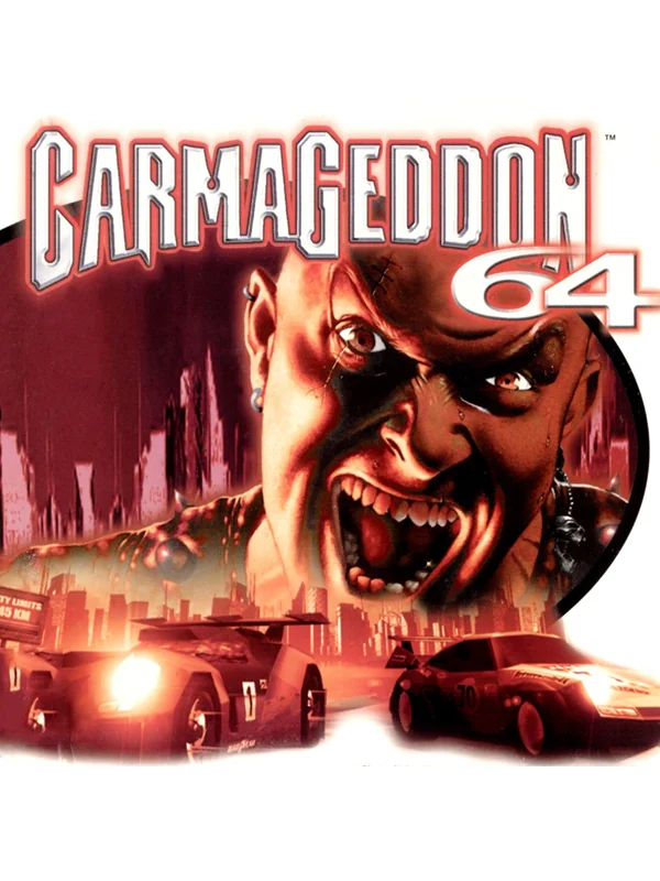
A bald man snarls with his mouth wide open over a burning city and a few cars, painted in muddy reds and browns. It is ugly on purpose, but it is still ugly. It also promises carnage that the game toned down in places, since in some countries the pedestrians became zombies and the blood turned into green slime.
4. Deadly Arts (1998)
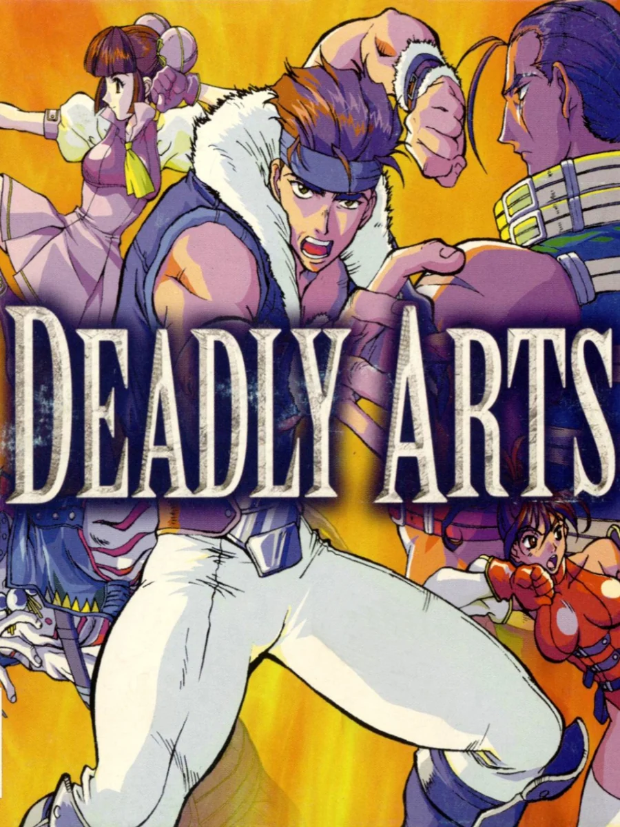
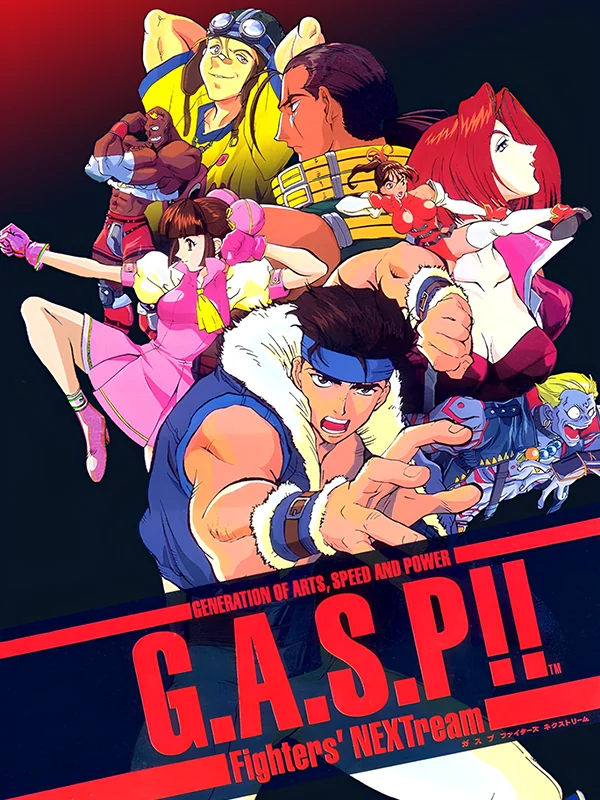
A crowd of anime fighters is crammed onto the American box under a huge flat logo, with nobody given room to look cool. Europe's box is just as crowded, but at least it had the wonderful title G.A.S.P!! Fighters' NEXTream printed across the bottom.
3. Bio F.R.E.A.K.S. (1998)
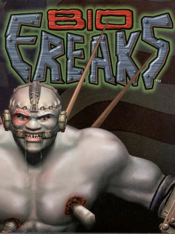
A grey, muzzled cyborg with tubes sticking out of his body glares from under a metal logo. Every colour has been drained out of it, so the box looks like a photocopy of a better cover.
2. Virtual Chess 64 (1998)
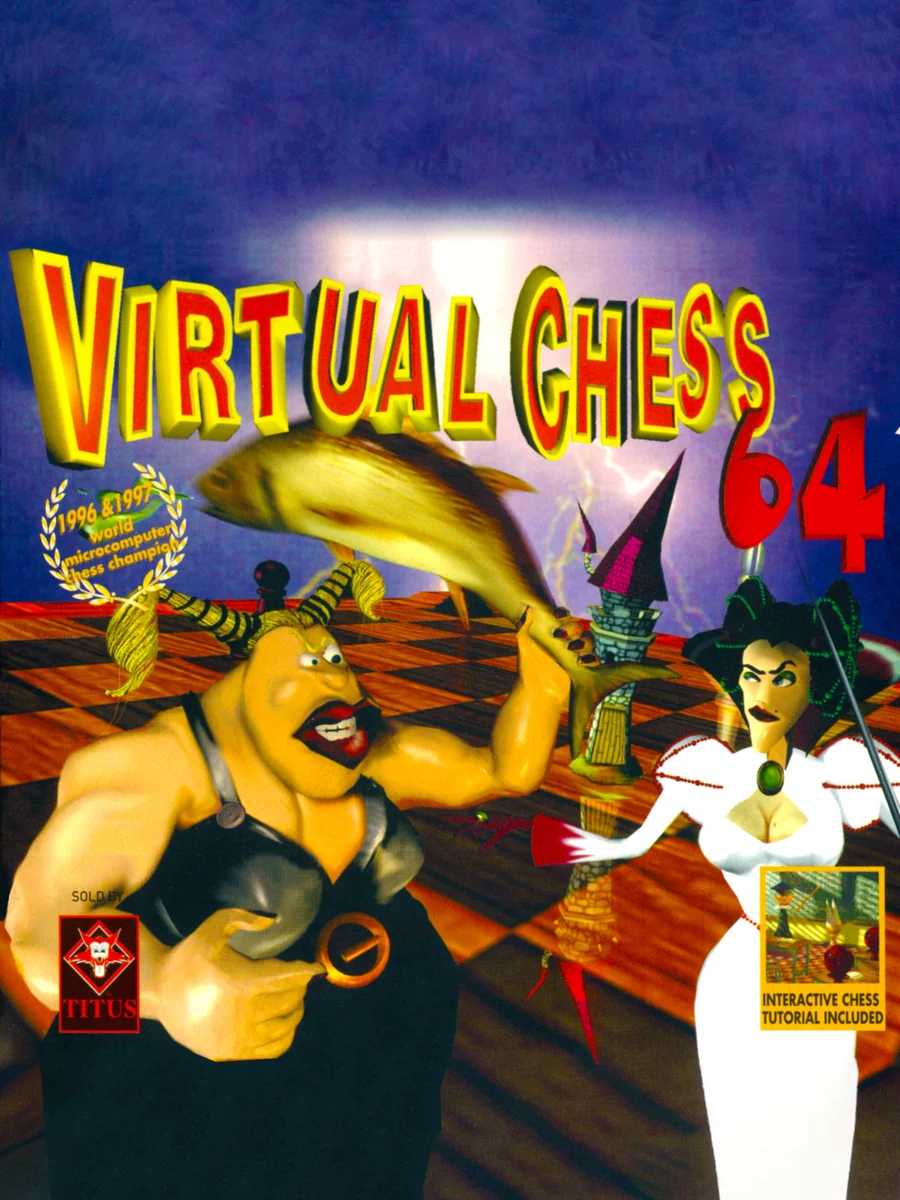
A Viking holding a fish grins at the front of the box while a woman in a white dress stands behind him on a chessboard. Is that how chess works? We have questions, and the box answers none of them.
1. Quest 64 (1998)
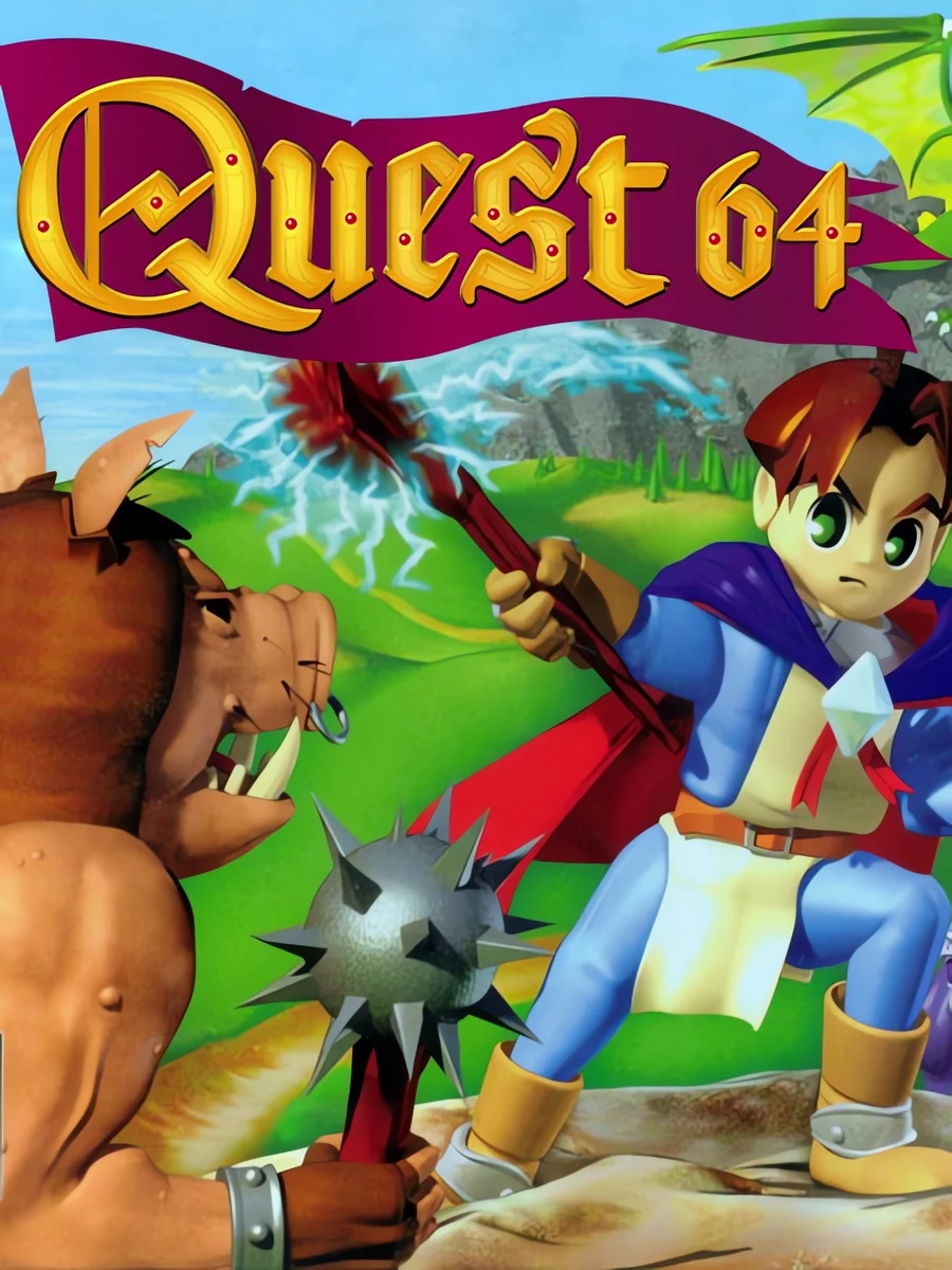
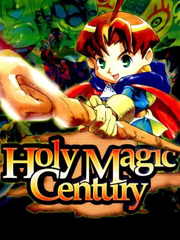
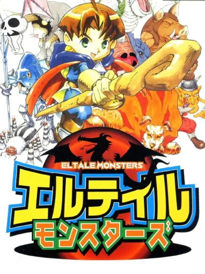
A boy with a staff stands in front of a lumpy 3D field and a spiked ball, all rendered in stiff early polygons. Europe's box, where the game was called Holy Magic Century, and Japan's, where it was called Eltale Monsters, both use bright anime art instead. Same game, but America got the stiffest cover of the three.
The covers that got it right: the best N64 box art.