The PSP case was tall and thin, a little like a DVD that had been on a diet. These ten covers used every inch of it.
10. Lumines (2004)
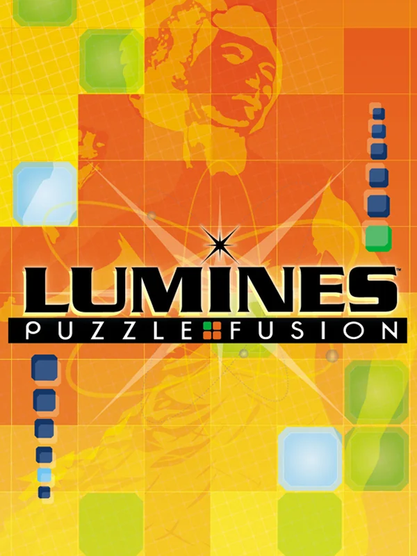
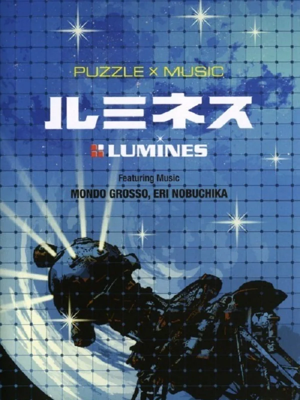
A grid of orange and yellow squares fills the American box, with a figure in headphones fading into it and the logo set like a club flyer. It was a launch title, and it looks like nothing else that came out alongside it. Japan's box, by contrast, goes cool and blue, with the featured artists Mondo Grosso and Eri Nobuchika printed on the front like an album.
9. Jeanne d'Arc (2006)
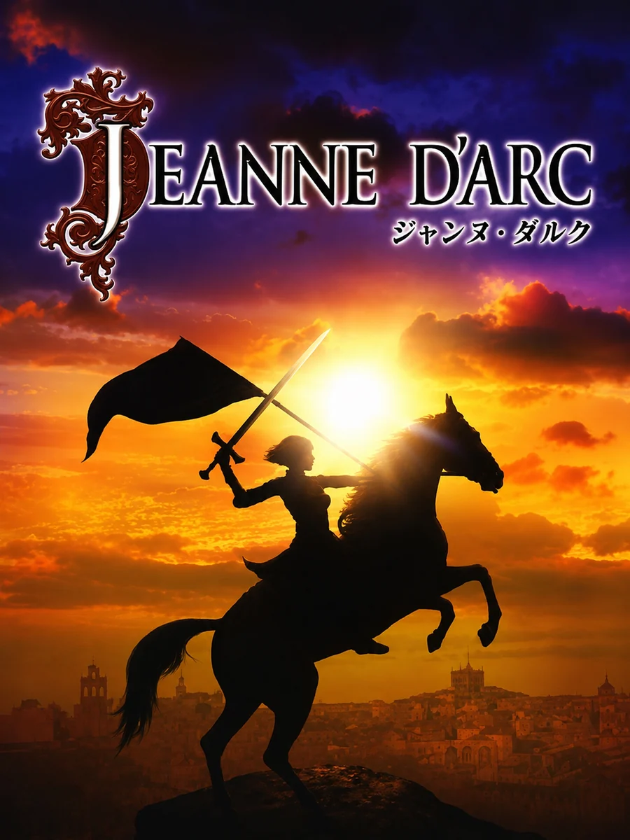
Jeanne rides a black horse across a blazing sunset, her flag raised, all in silhouette. That is the Japanese box. The American one, in contrast, swaps the sunset for Jeanne standing in golden armour, and loses the drama.
8. PoPoLoCrois (2005)
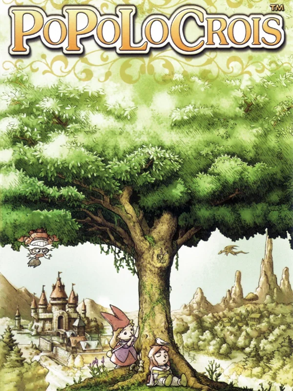
An enormous green tree towers over a tiny castle, painted in soft watercolour, with the heroes standing small at its roots. It looks like the first page of a picture book, which is exactly the right promise for this series.
7. Metal Gear Solid: Peace Walker (2010)
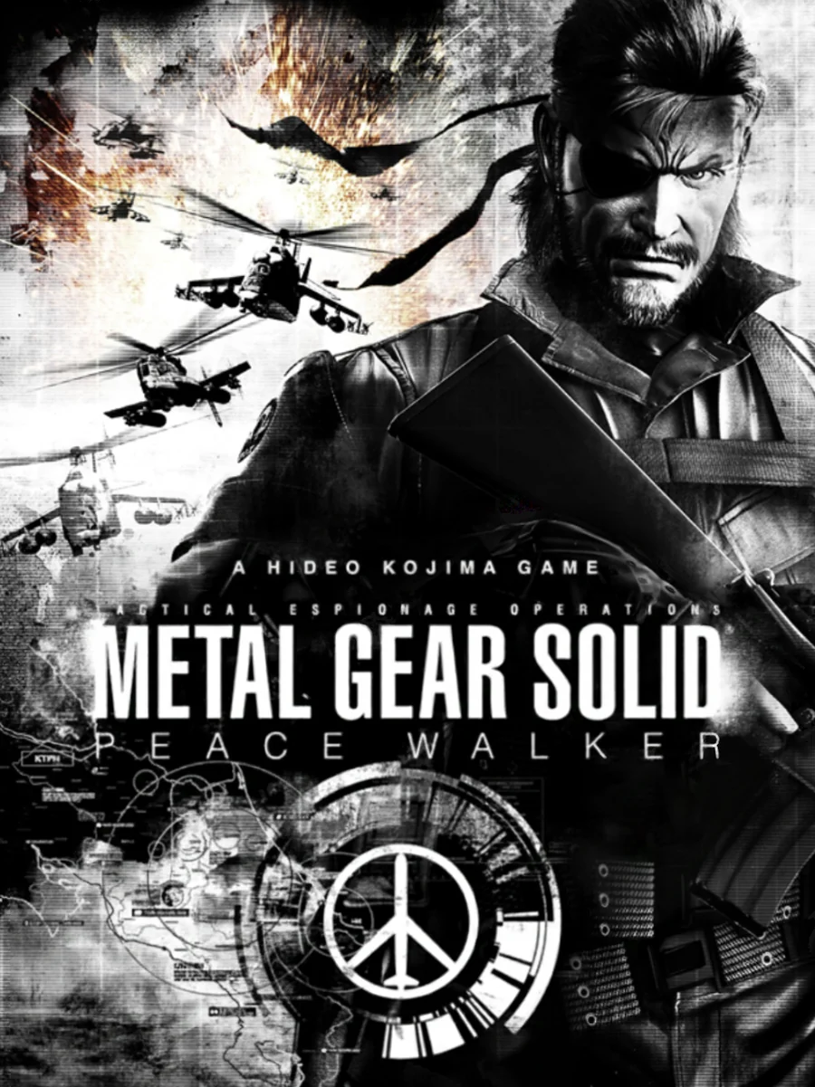
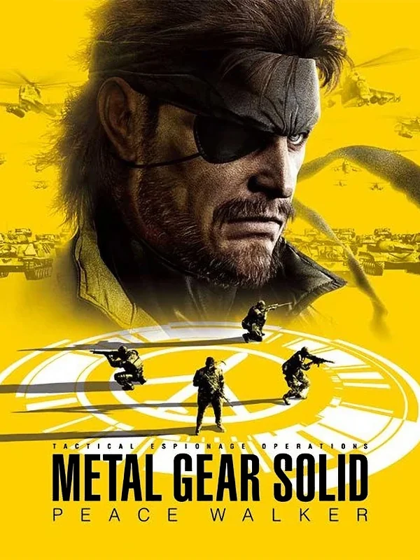
The American box is a grey photo-real Snake over a field of soldiers and a helicopter, with a peace sign at the bottom. Japan's box, on the other hand, is bright yellow, with Snake's face at the top and his tiny army marching across the bottom. Same game, but only Japan looked like it was having fun.
6. Metal Gear Acid (2004)
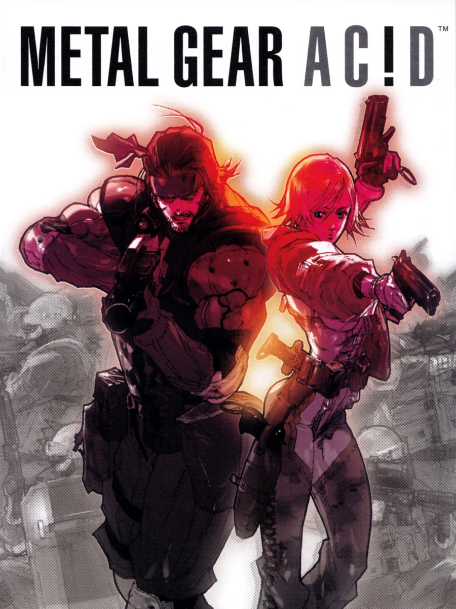
Snake and an enemy soldier face off in a haze of red and orange, painted in loose, scratchy strokes. The title is stylised in capitals, with an exclamation mark standing in for the i. It feels like a comic book cover, and fittingly, Snake was there at the PSP's launch with it.
5. Wipeout Pure (2005)
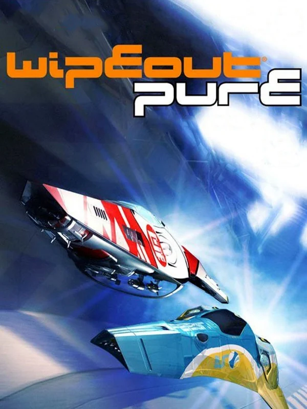
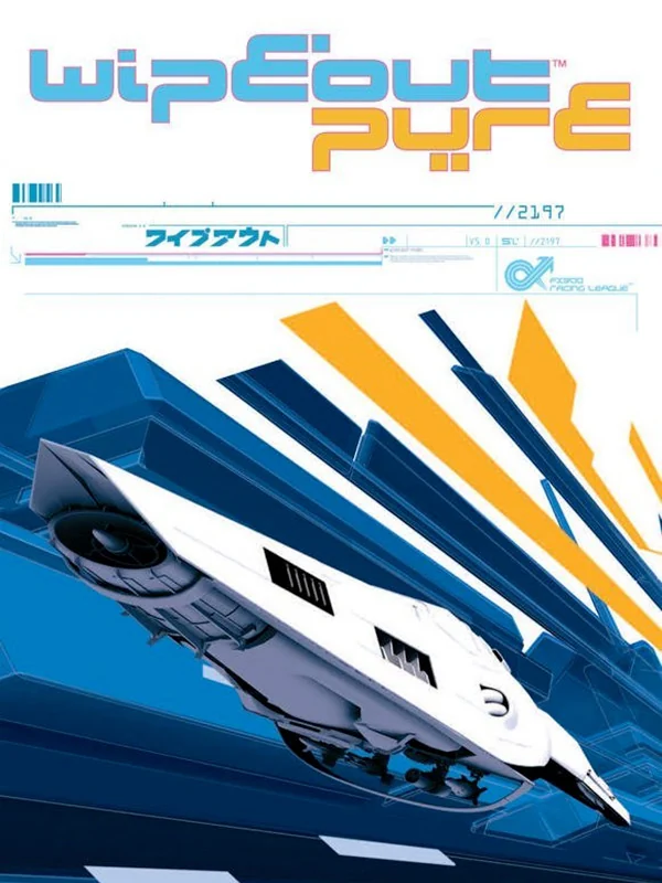
The European box is pure graphic design: a white ship slices through blocks of blue and orange, with tiny type scattered around it like a poster in a record shop. The cover art was designed by Popgun, a studio that also designed the logos for EA Sports games. The American box, by comparison, is a ship on a white page.
4. Every Extend Extra (2006)

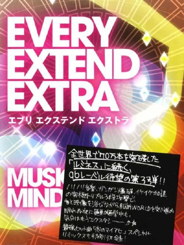
Rainbow light streams out of the back of a black head in profile, against a black box. That is all you need to know about a Q Entertainment shooter. The Japanese box, meanwhile, ditches the head for loud pink type and a handwritten note.
3. LocoRoco (2006)
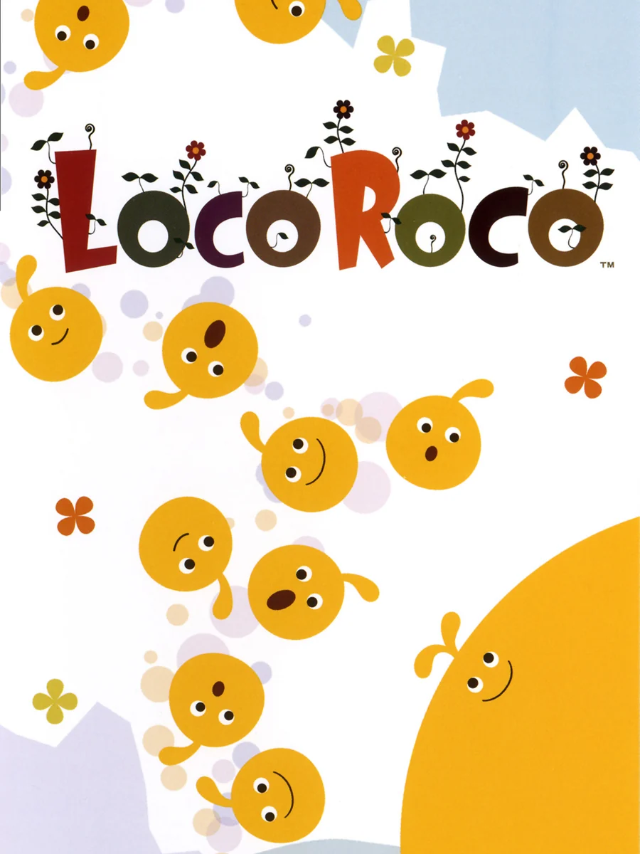
A handful of smiling yellow blobs bounce down a white box, and that is the whole cover. Tsutomu Kouno, who conceived the game, wanted every aspect of it to be unique, and the box agrees with him.
2. Echochrome (2008)
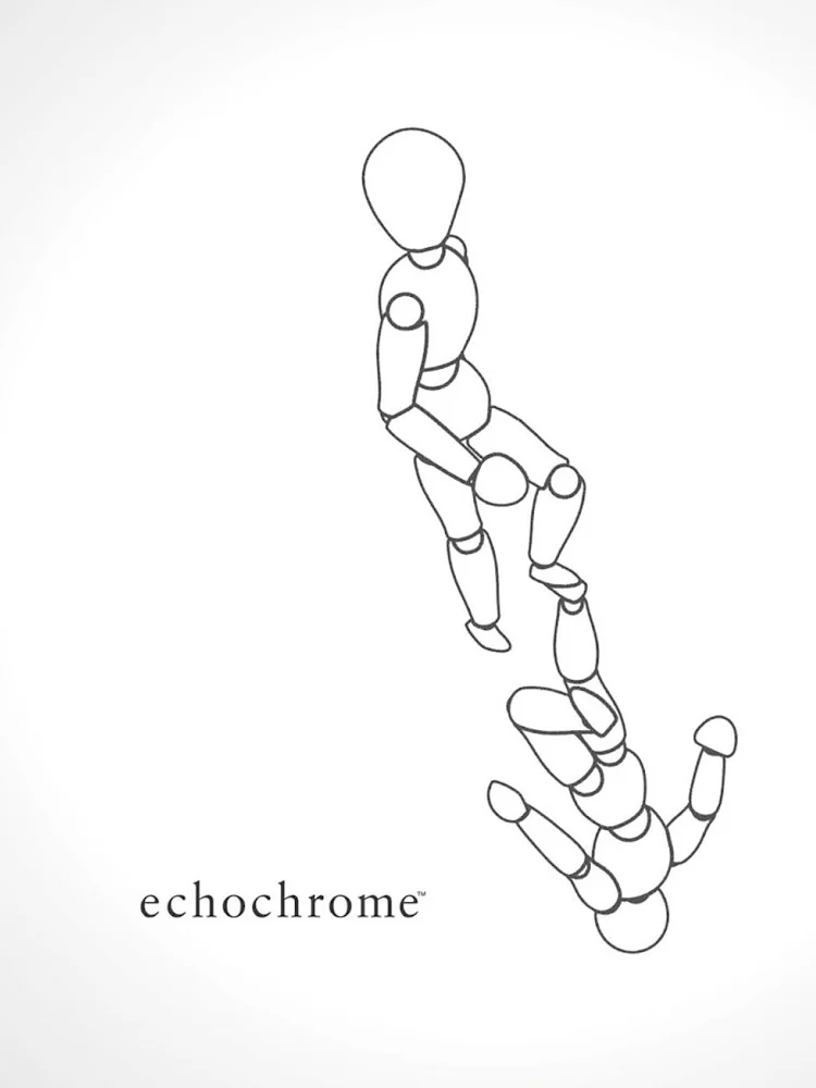
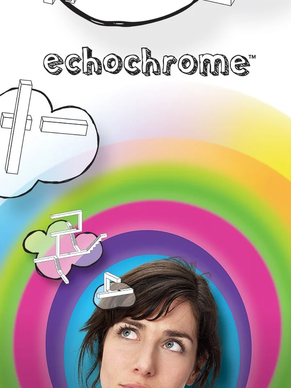
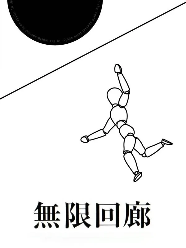
The American box is almost blank: a thin outline of a wooden artist's mannequin floats across a white page. Japan's box adds a single black line and a black circle, while Europe goes in the opposite direction with a woman's face inside a rainbow target. The game draws on the artwork of M. C. Escher, and the white boxes look like they belong in the same gallery.
1. Patapon (2007)
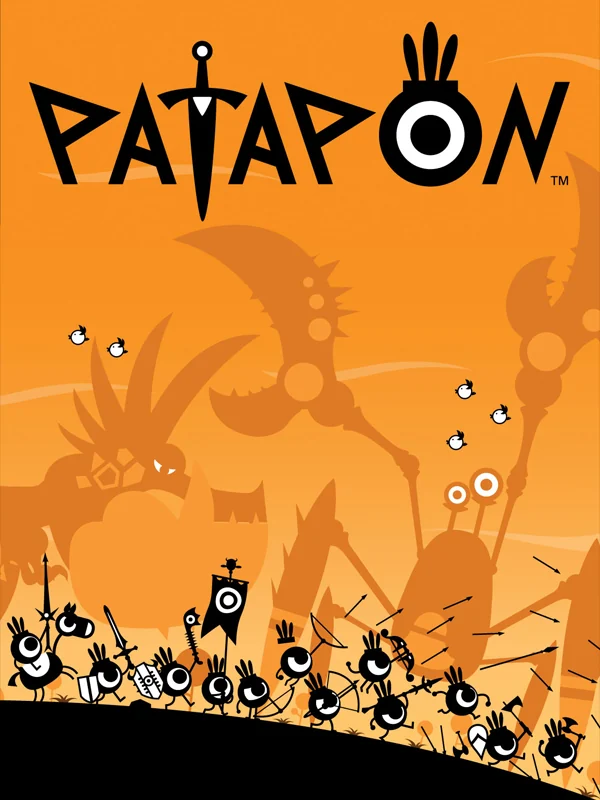
An army of tiny black eyeballs with spears marches along the bottom of a bright orange box, under a big round sun. The Patapon were designed by the French artist Rolito, and the whole game was built around his creatures after a designer found them on his website. You can see why from the box alone: it is a perfect poster.
The other side of the shelf: the worst PSP box art.