
The PSP could play films as well as some of the best handheld games of its decade. Its boxes, sadly, did not always get the memo.
10. International Athletics (2008)

A sprinter screams mid-stride while a hurdler leaps behind him, both pasted over a giant French flag. It tells you the sport and nothing at all about the game.
9. Smart Bomb (2005)
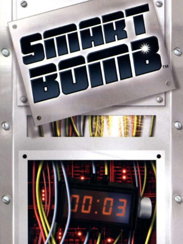
A chunky chrome logo hangs over a bomb with a red digital timer and a tangle of wires, all in grey. It is accurate, at least. It is also about as inviting as a fuse box.
8. Mercury Meltdown (2006)
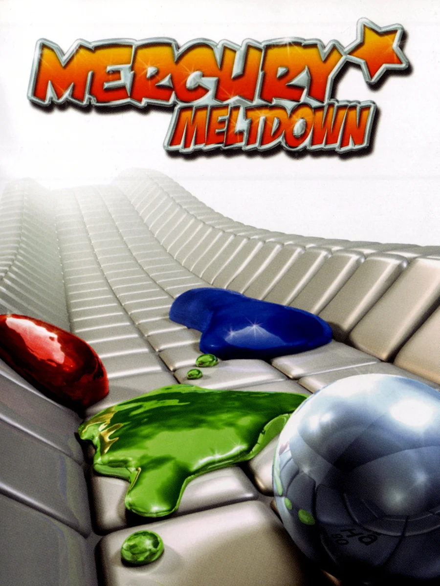
A blob of silver liquid rolls across a grey tiled surface next to a green splat, under an orange logo. The game is the sequel to Archer Maclean's Mercury, a clever puzzler, but the box makes it look like a screensaver.
7. Payout Poker & Casino (2006)

A woman in a red dress leans out of the box next to a fan of playing cards and a roulette wheel. It is the most generic casino picture imaginable, and nothing on it tells you anything about the game.
6. Dead or Alive Paradise (2010)

A woman in a blue bikini top fills the box, with a strip of film and a hibiscus flower stuck along the bottom. The game is a PSP port of Dead or Alive Xtreme 2, so at least the box is honest. Even so, it is a lazy picture, and the logo is almost lost in it.
5. Ford Bold Moves Street Racing (2006)


A red Ford Mustang with white racing stripes sits head-on against a flat yellow background, under the Ford logo. It looks exactly like a car advert, and the name does not help. Europe, where the game was called Ford Street Racing: L.A. Duel, at least got a silver car speeding through a city.
4. Gangs of London (2006)

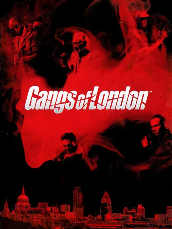
A row of grey men in suits stands on a white box, with a pistol poking in from the bottom like it got lost. Europe's box, by comparison, is a red London skyline with the logo slashed across it, which feels far more like the third game in the Getaway series.
3. Kingdom of Paradise (2005)


The American box shows the hero holding his sword in front of a green, misty ruin, all washed out and soft. Meanwhile, the European release, called Key of Heaven, got the same hero swinging into battle in a blaze of red and orange. It is the same character, but only one of the boxes looks like it wants your attention.
2. Carol Vorderman's Sudoku (2006)

Carol Vorderman smiles in a red dress beside a giant blue SUDOKU and a slice of the grid. If you wanted a sudoku book with a famous face on the cover, here it is. Is it a game, though? The box is not sure either.
1. Brooktown High (2007)

Two cartoon teenagers lean in for a kiss in front of a red and white logo, stiff as shop mannequins, with her arms flung out. It is a dating sim, so the subject is right. The pose, however, makes the whole thing look deeply uncomfortable.
The covers that got it right: the best PSP box art.