
The GameCube had a small library and small boxes, but the art on them punched well above their size. These ten are the proof.
10. Metroid Prime (2002)
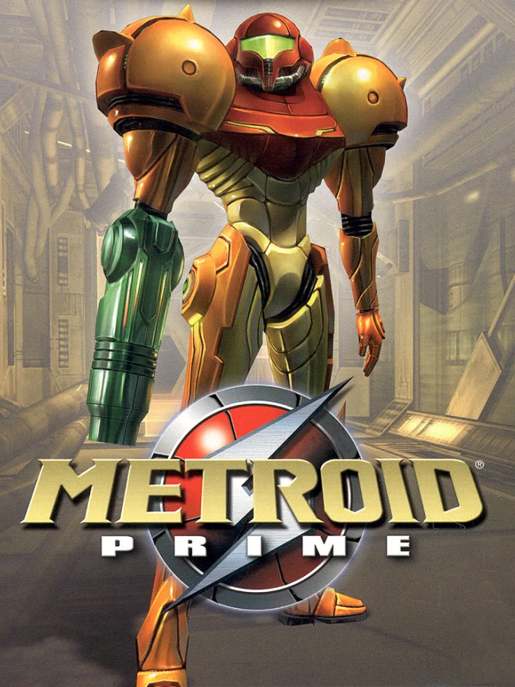
Samus stands tall in her orange armour, visor glowing, framed by the dark rock of an alien world. It is not a complicated cover. Still, it says everything it needs to.
9. Chibi-Robo! (2005)
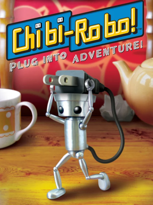
A tiny silver robot stands among a teapot and teacups twice his size, trailing his plug behind him like a tail. The scale tells the whole story: this is a game about a little robot doing housework in a family home, and the box makes that look like an adventure.
8. Odama (2006)
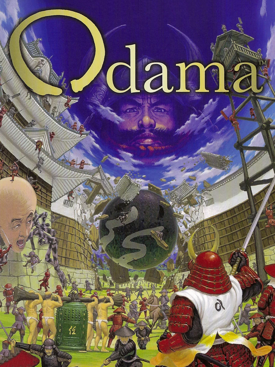
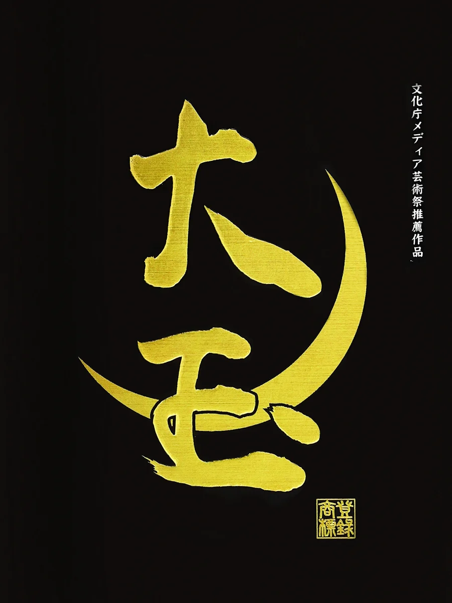
Japan's box is completely black except for the title, painted in gold brush strokes, with a single gold curve under it. The American box, by contrast, is a crowded battlefield. The game blends tactical wargaming with pinball in feudal Japan, and the Japanese box looks as strange and serious as that sounds.
7. Doshin the Giant (2002)
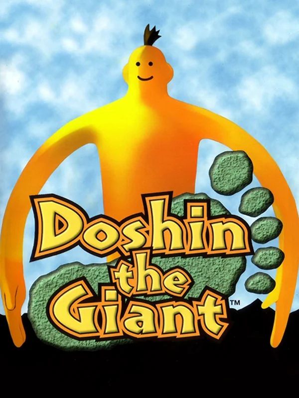
A huge yellow giant with a tiny smile stands against a black background, his arms framing the title. That is the whole box, and it is perfect for a game that began life as a launch title for the 64DD in Japan.
6. Resident Evil (2002)
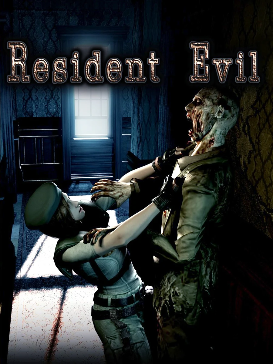
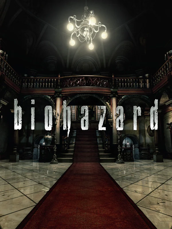
Japan's box shows the grand hall of the mansion from the bottom of the stairs, with the chandelier glowing and a red carpet leading you in. It is quiet, and that is what makes it frightening. The American box, on the other hand, goes for a zombie grabbing a hero, which is far more ordinary.
5. Eternal Darkness (2002)
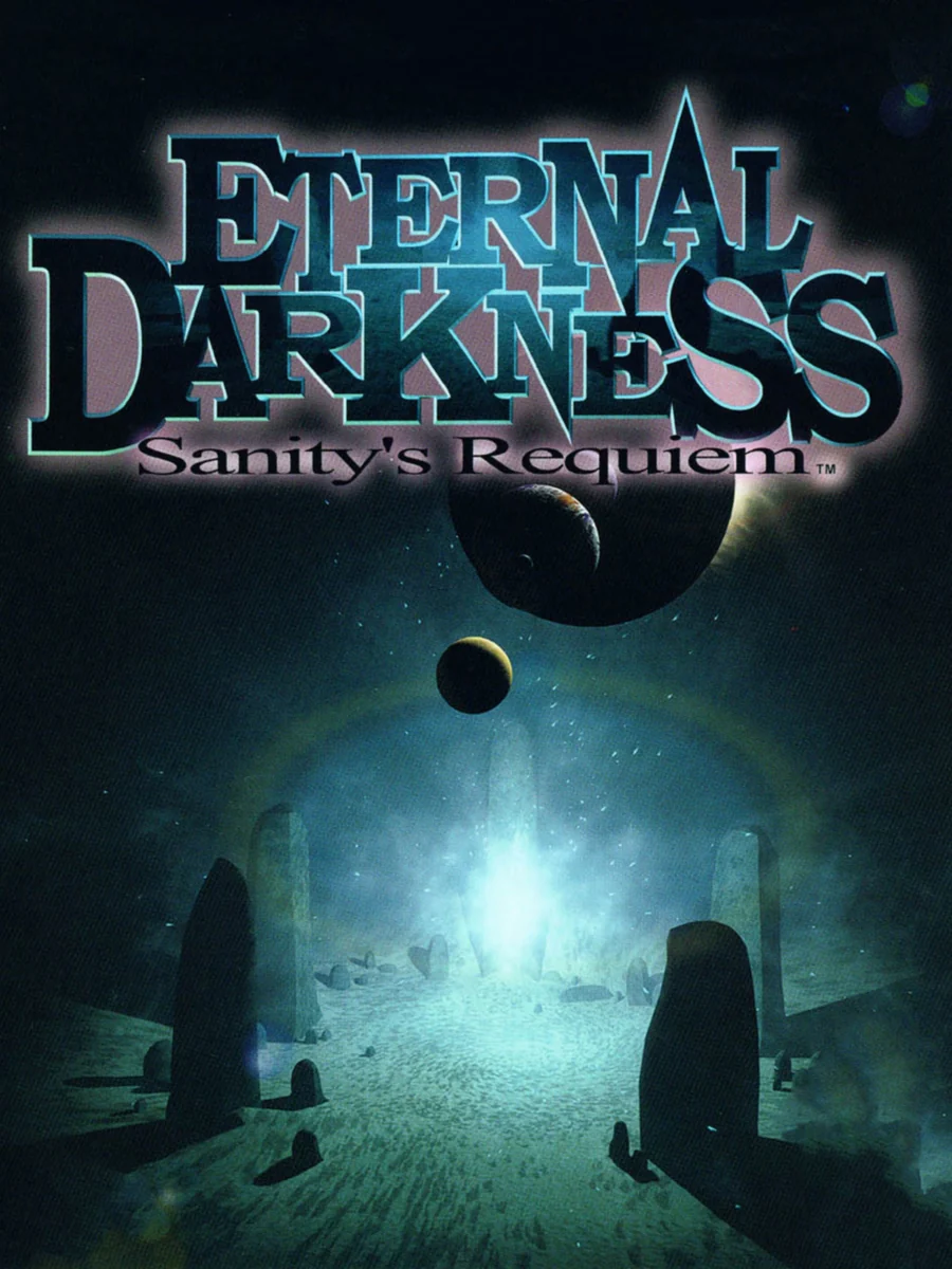
A lonely figure walks toward a glowing doorway in a vast, blue, ruined hall, with a dark moon hanging above. It is cold and eerie, and it suits a game whose sanity effects mess with the player directly, sometimes faking errors on your own TV.
4. Pikmin (2001)
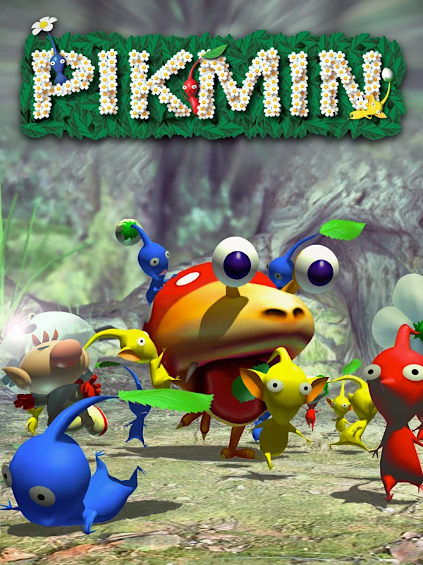
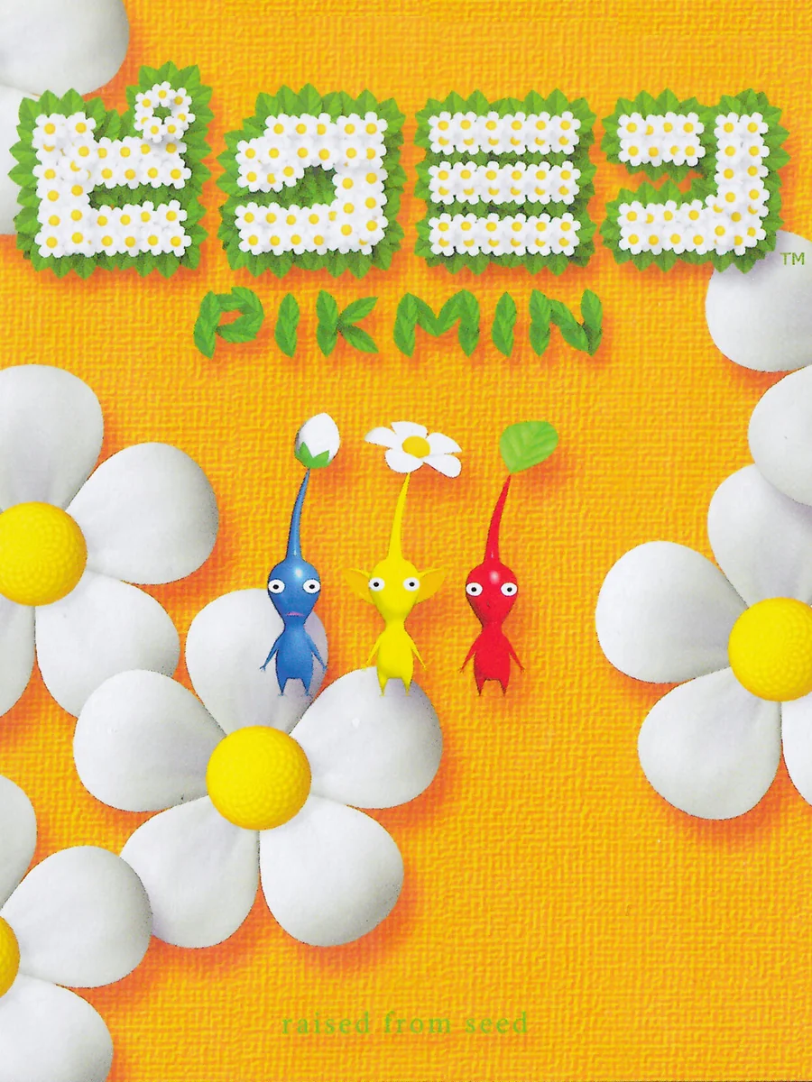
Japan's box is a field of giant white daisies on a bright yellow background, with three tiny Pikmin peeking out between the petals. The American box, by contrast, is a busy 3D group shot of Captain Olimar and his crew. The Japanese one looks like a children's book, and it is lovely.
3. Viewtiful Joe (2003)
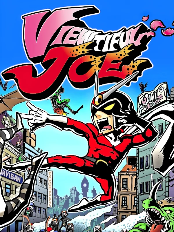
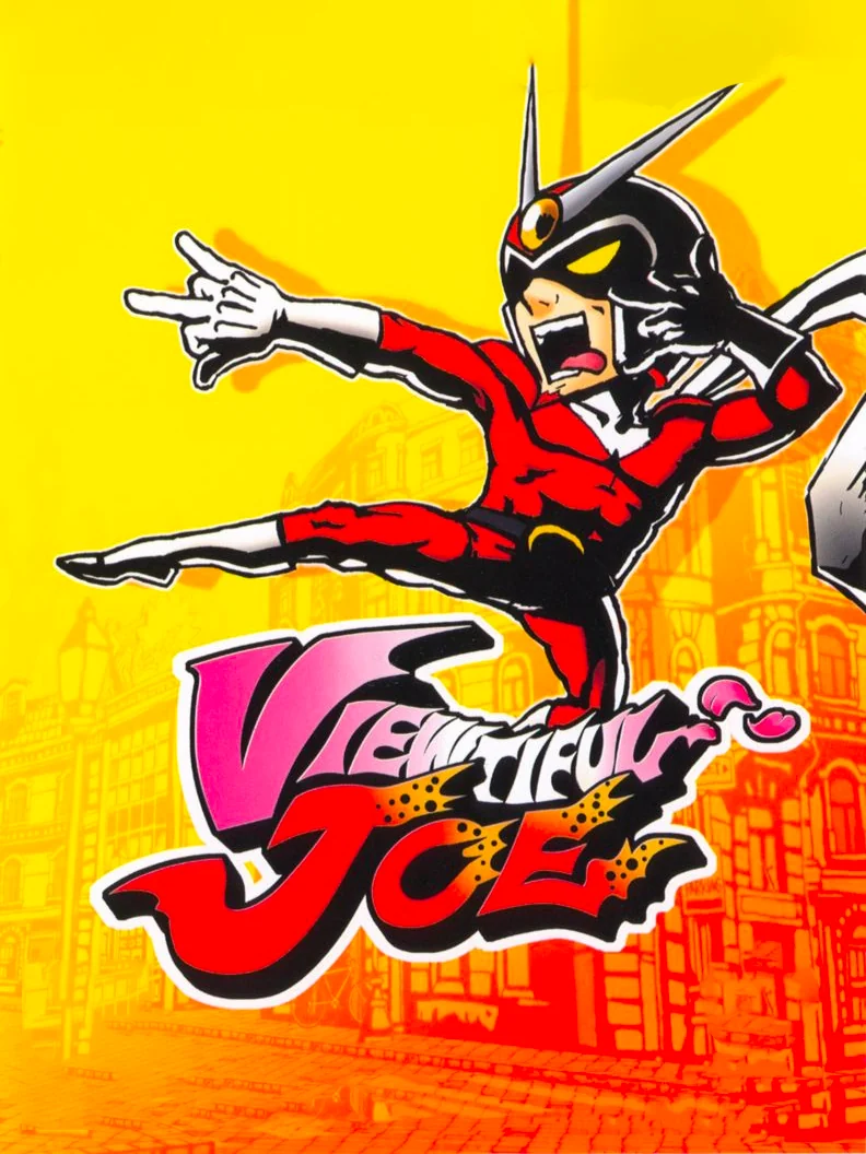
In Europe, Joe strikes a hero pose in his red suit on a bright yellow background, drawn in thick, flat lines like a comic panel. The American box crams him into a busy comic collage instead. Joe is a movie fan who turns into a tokusatsu-style hero, so the clean European pose fits him best.
2. Ikaruga (2002)
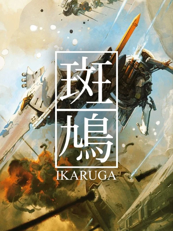
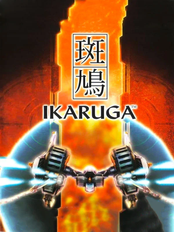
The title stands in huge black kanji on a white panel, while a ship flies through a sepia sky behind it. It looks less like a game box and more like a poster for an art exhibition. Europe's version, meanwhile, swaps the white for a hot orange glow.
1. The Legend of Zelda: The Wind Waker (2002)
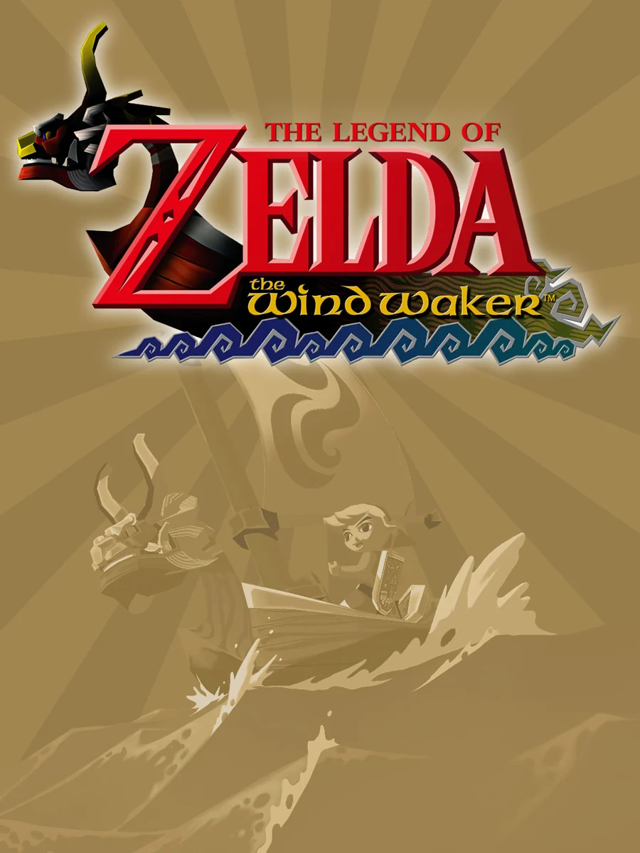
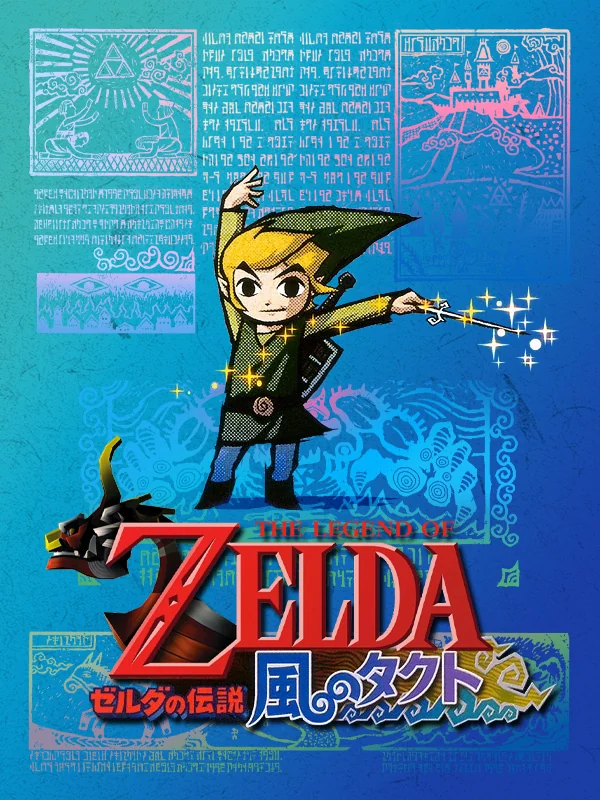
Japan's box puts the cartoon Link on a bright blue background inside a frame of old writing and carvings, like a page from an ancient sea chart. The American box, by contrast, is a gold field with the scene etched faintly into it. The game's cel-shaded art style set it apart from everything else on the shelf, and the Japanese box shows it off proudly.
The other side of the shelf: the worst GameCube box art.