The DS had a game for everyone, and a few thousand of them for people nobody had asked. These boxes came from that second pile.
10. Puppy Palace (2008)
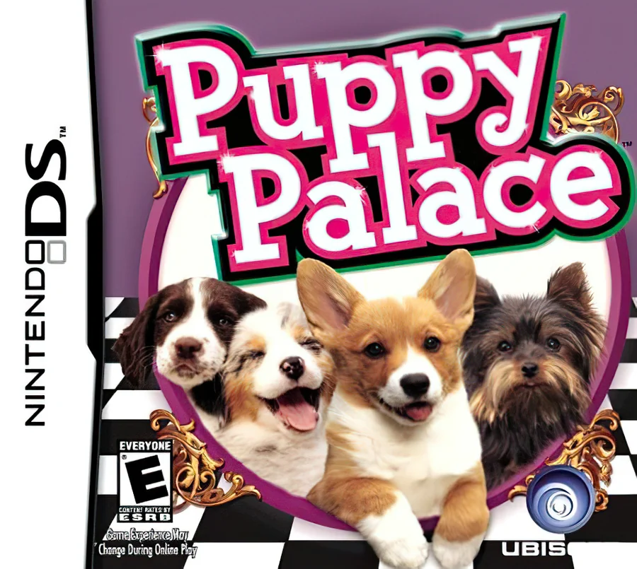
Four puppy photos are lined up across a black and white checkered floor under a fat pink logo. The dogs are cute, of course. The box around them, however, gives you no idea what the game is.
9. Gummy Bears Minigolf (2010)
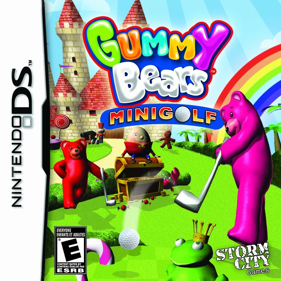
Shiny 3D gummy bears in red, green and pink swing golf clubs in front of a castle and a rainbow. Each one looks like it is melting slightly, which is the opposite of what you want from a mascot.
8. C.O.R.E. (2009)

A soldier in a green visor aims a big gun out of a grey fog, next to a metal logo. It could be the cover of almost any shooter from the decade, and that is exactly the trouble with it.
7. Pac-Pix (2005)
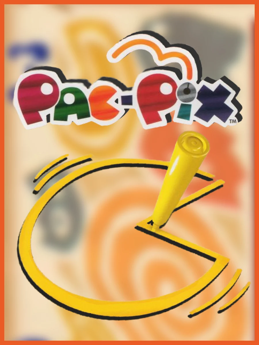
A pencil draws a yellow Pac-Man on a smeared orange background that looks out of focus. It does tell you the idea, since you draw your own Pac-Men with the stylus. Even so, the blur makes the whole box look like a misprint.
6. Snood 2: On Vacation (2005)
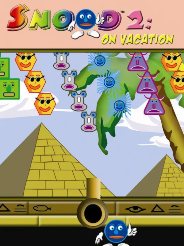
Dozens of flat cartoon faces float over two pyramids and a cannon, as if someone pasted a screenshot over a holiday postcard. On vacation where, exactly? Egypt, apparently, and nobody looks happy about it.
5. Imagine Babyz (2007)

Three stock photos of babies sit on a white box next to a thin grey logo. There is nothing wrong with the babies. There is just nothing else on the box, not even a hint of the game.
4. Elf Bowling 1 & 2 (2005)
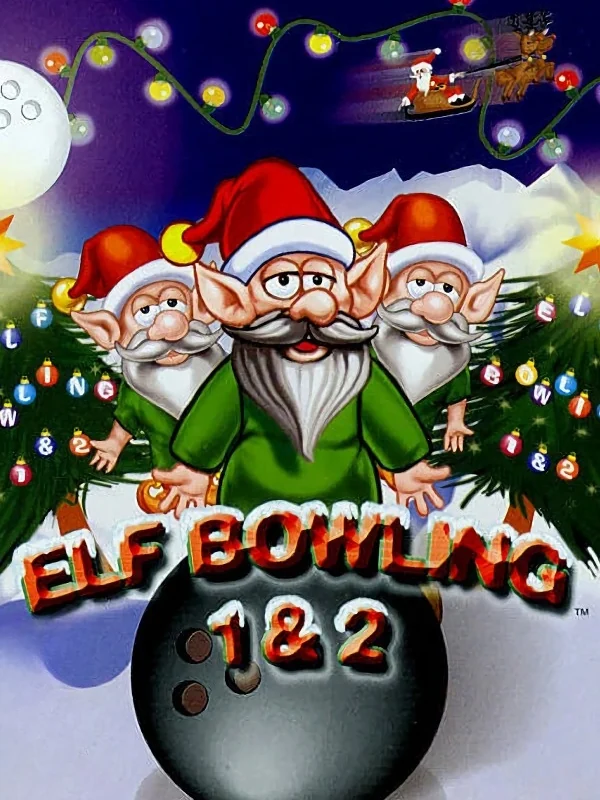
Three plastic-looking elves in Santa hats grin out from behind a bowling ball, wrapped in fairy lights. They look like a screensaver from the late 90s, and that is about right: these were originally Flash games from 1998, and no effort was taken to expand on them.
3. Diamond Trust of London (2012)
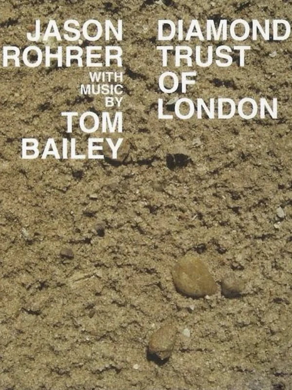
The whole front of the box is a photo of dirt, with the names Jason Rohrer and Tom Bailey printed on it in plain white type. It is a bold choice for the first successfully crowdfunded Nintendo DS game. Meanwhile, the photo of the two men went on the back.
2. Retro Atari Classics (2005)
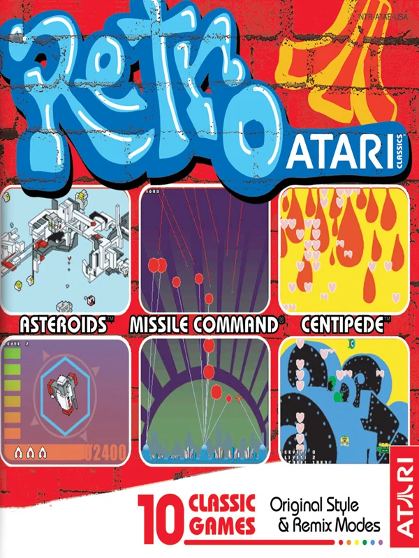
A bubbly graffiti logo sits over a grid of screenshots of old Atari games, with paint drips running down the edges. The graffiti comes from the remix mode, for which Atari hired real graffiti artists, including Shepard Fairey. Critics, however, were unkind: one called the remix artwork "hideous graffiti-strewn abominations".
1. Lunar: Dragon Song (2005)
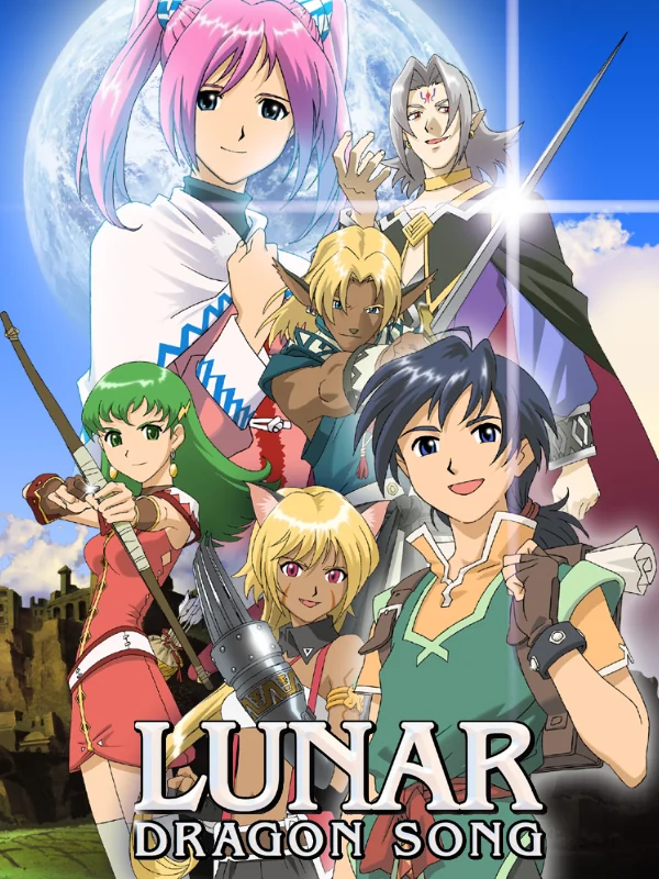
Nearly the whole cast is crammed onto the box at once, pink hair and green hair and swords everywhere, with no clear hero to look at. Worse, the American cover brags that it comes from the developers of Lunar: The Silver Star. Yet the game does not even look like the series, since the super-deformed characters are replaced by more realistically proportioned sprites.
The covers that got it right: the best Nintendo DS box art.