The Vita never got the library it deserved, but the games it did get often came in gorgeous boxes. These ten are the best of them.
10. Wipeout 2048 (2012)
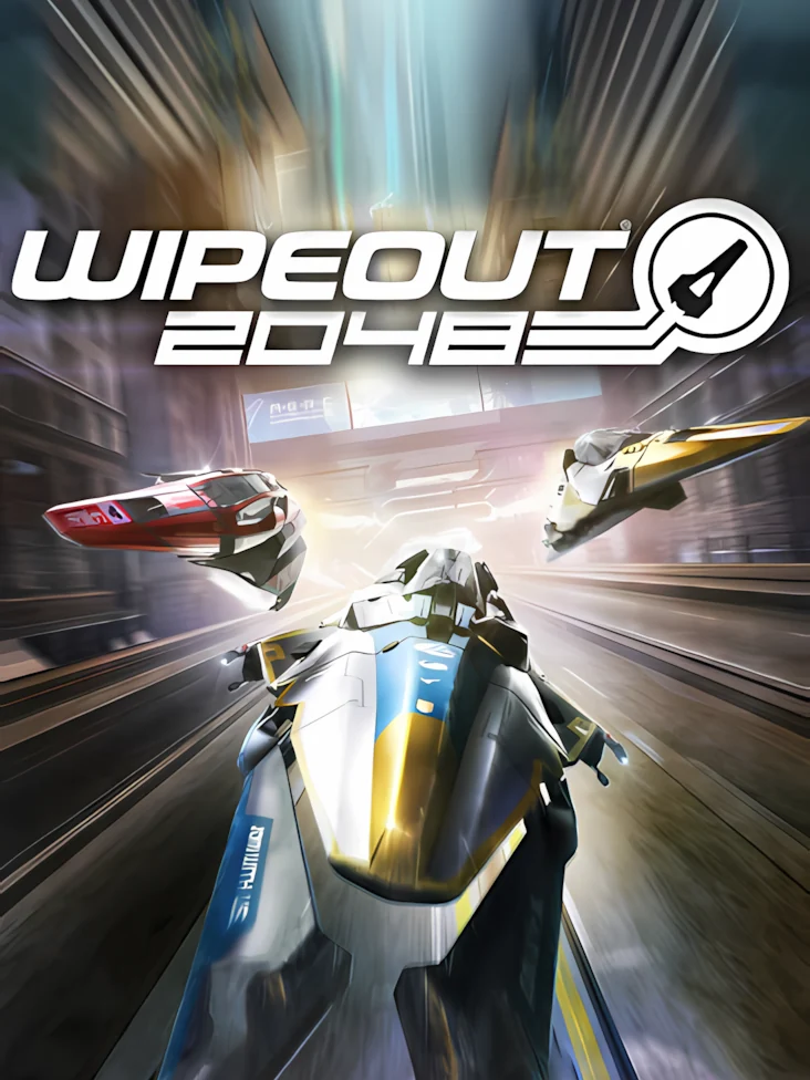
Three ships tear toward you down a neon track in a blur of blue and silver, with the city stretched out on either side. It is fast and simple, which is exactly what a Wipeout box should be.
9. DJMax Technika Tune (2012)
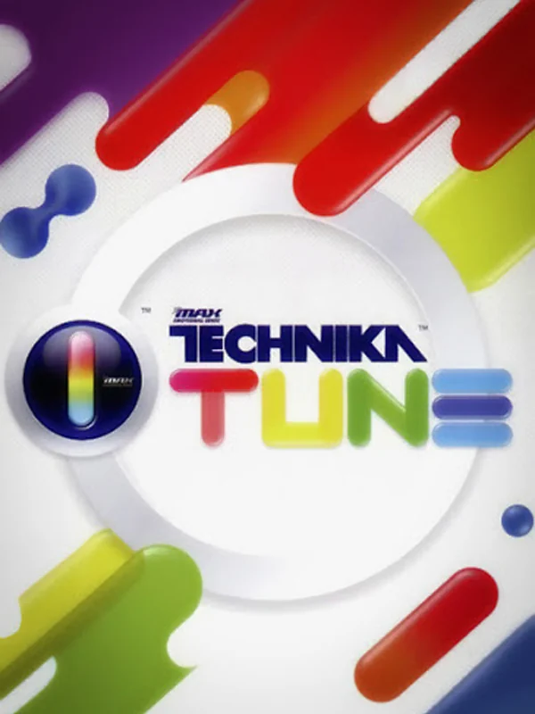
Rounded stripes in every colour curve across a white box around a round logo, like the label on a record. There is no character in sight, and it does not need one.
8. Lumines: Electronic Symphony (2012)
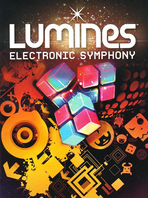
A cluster of glowing cubes floats over an orange and black pattern that looks like a speaker cone. The series began on the PSP as the work of Tetsuya Mizuguchi, and this box still looks like the cover of a club night.
7. Touch My Katamari (2011)
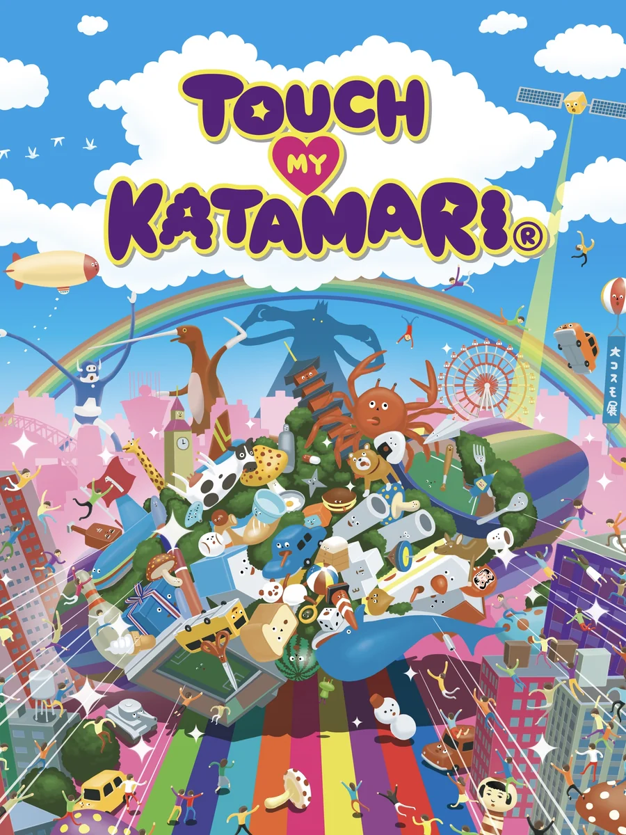
A rainbow road runs under a sky full of clouds, while a gigantic ball of junk rolls up the middle of the box. Every inch is crammed with tiny objects, which is the right promise for a Katamari game. It was also one of the Vita's launch games in Japan.
6. Muramasa Rebirth (2013)
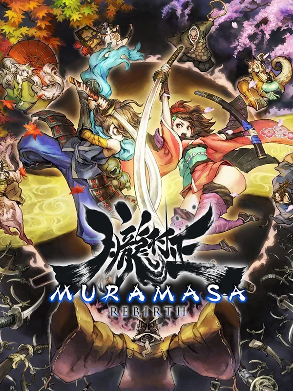
Samurai and demons swirl around the title among flashing swords, in rich reds and golds, like a painted folding screen. That fits, since the director George Kamitani based the story on kabuki theatre.
5. Persona 4 Golden (2012)
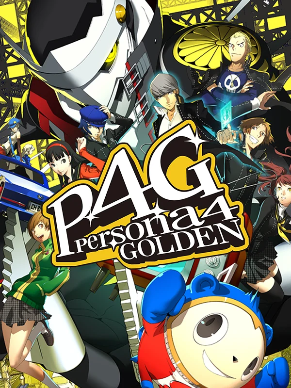
The whole cast crowds into a black and yellow collage, with the round bear Teddie bursting out at the bottom. It is loud and busy, but it is busy with purpose, and every face on it looks like a person you would meet in the game.
4. Child of Light (2014)
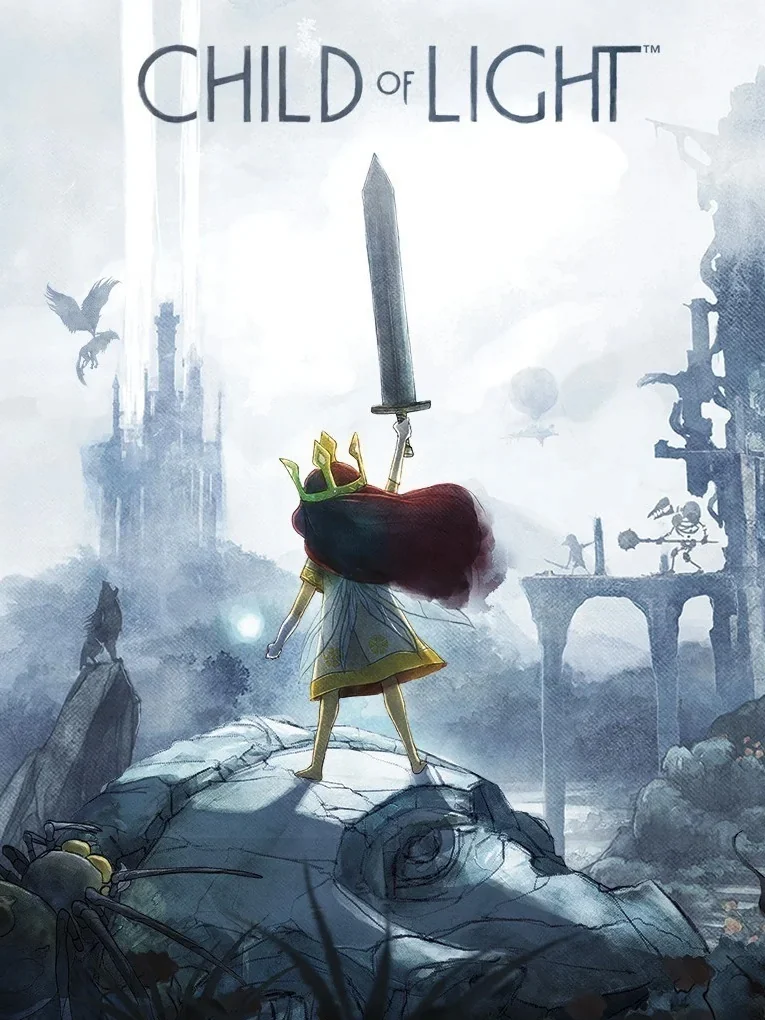
A small red-haired girl holds up a sword far too big for her, standing on a rock in front of a pale castle painted in soft watercolour. The art was inspired by Studio Ghibli and Yoshitaka Amano, and the box looks like a page from an old fairy tale book.
3. Danganronpa: Trigger Happy Havoc (2010)
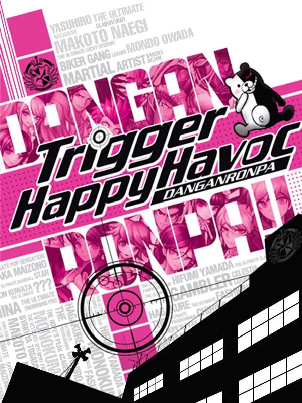
Hot pink type is slapped over a black and white school, with a crosshair in the middle and a grinning half-white, half-black bear peering in from the corner. It looks like a punk flyer, which is exactly the tone of the game.
2. Tearaway (2013)
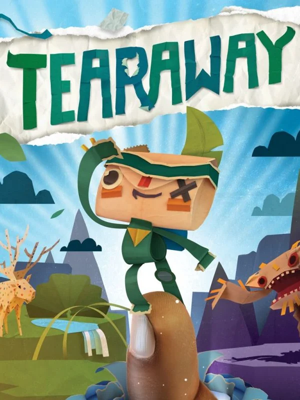
A little paper messenger with an envelope for a head leaps off a paper tree stump, under a logo made of torn strips. Even the sky looks cut out. The game is inspired by papercraft, so the box is a perfect sample of what is inside.
1. Gravity Rush (2012)
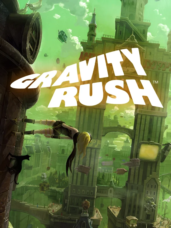
Kat falls head first through a green city of stone towers, with debris floating around her as if gravity has simply stopped working. In Japan, the game is called Gravity Daze, a title chosen to give an impression of strangeness, and this cover nails that feeling better than any other box on the system.
The other side of the shelf: the worst PS Vita box art.