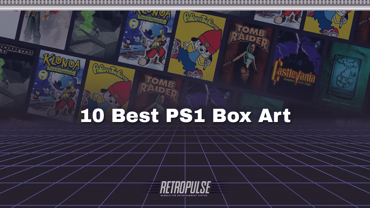
The PlayStation jewel case cracked if you looked at it wrong. Even so, these ten covers made it worth keeping the case in one piece.
10. Tomb Raider (1996)
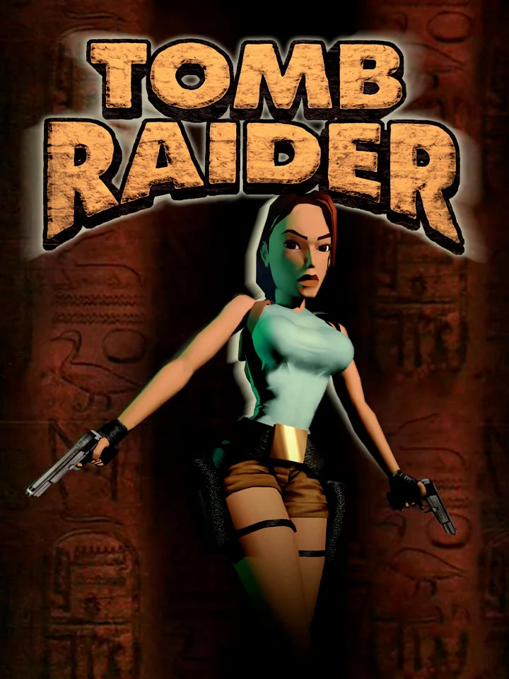
Lara Croft stands in a dark temple with a pistol in each hand, framed like a film poster. That was the point: the publisher added a "Featuring Lara Croft" tagline to the cover to give her the allure of a movie star. It worked, since she went on to appear on the covers of magazines that had nothing to do with games.
9. PaRappa the Rapper (1996)

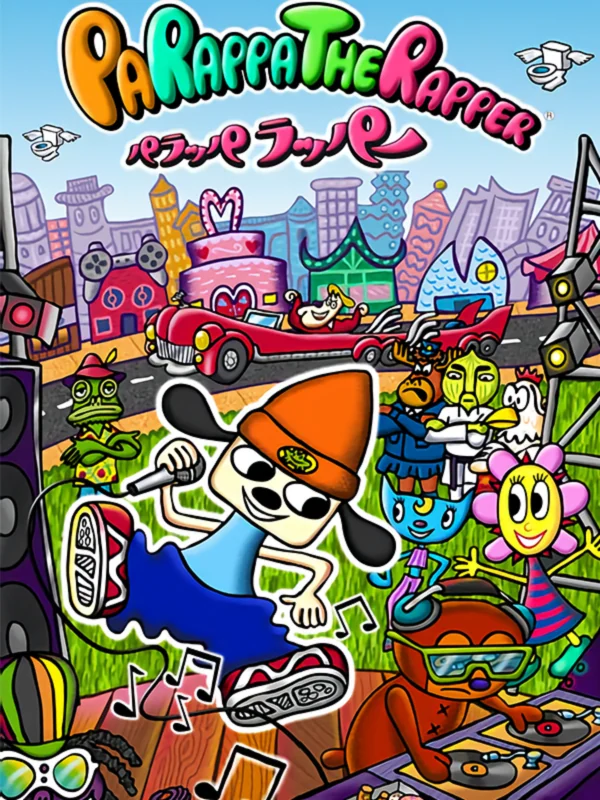
PaRappa bounces across a flat yellow box in his orange beanie, drawn in thick, wobbly lines. The characters are by the artist Rodney Greenblat, and nothing else on the shelf looked this happy. Japan's box, by contrast, crams the whole cast into a busy city scene.
8. Klonoa: Door to Phantomile (1997)
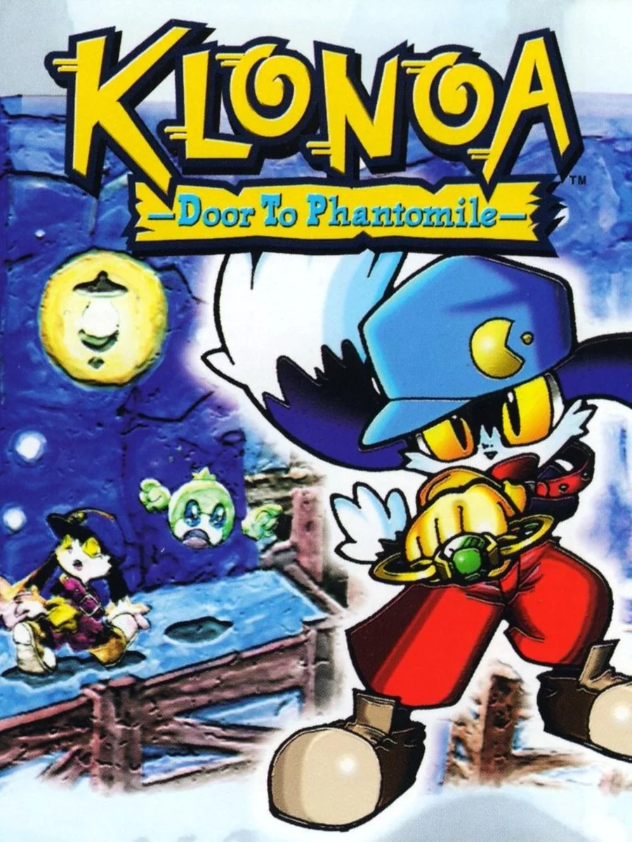
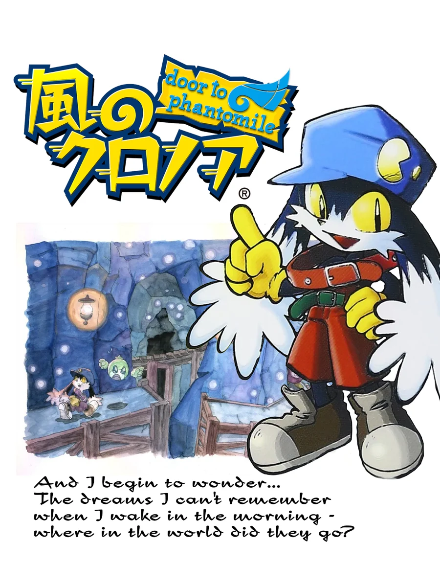
The American box has Klonoa in his cap, waving his ring against a deep blue sky. Japan's box, meanwhile, looks like a page from a picture book, with Klonoa pointing at you over a few handwritten lines about dreams you cannot remember.
7. Intelligent Qube (1997)
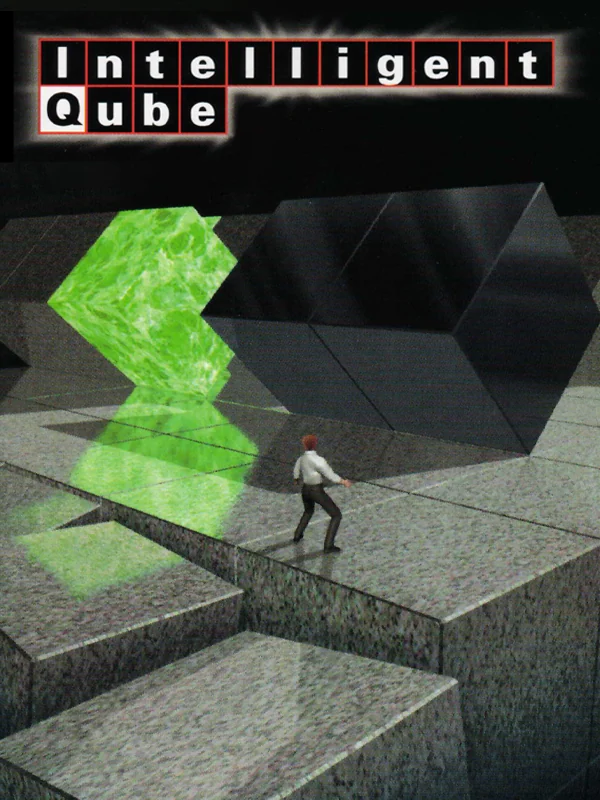
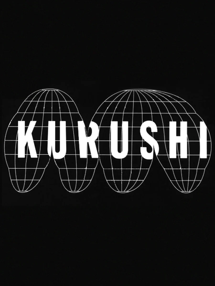
A tiny man stands at the edge of a stone platform while giant black cubes loom over him. It is quiet and slightly threatening, which is exactly how the game feels. Europe, where it was called Kurushi, got just the name in a wireframe globe on black.
6. Xenogears (1998)
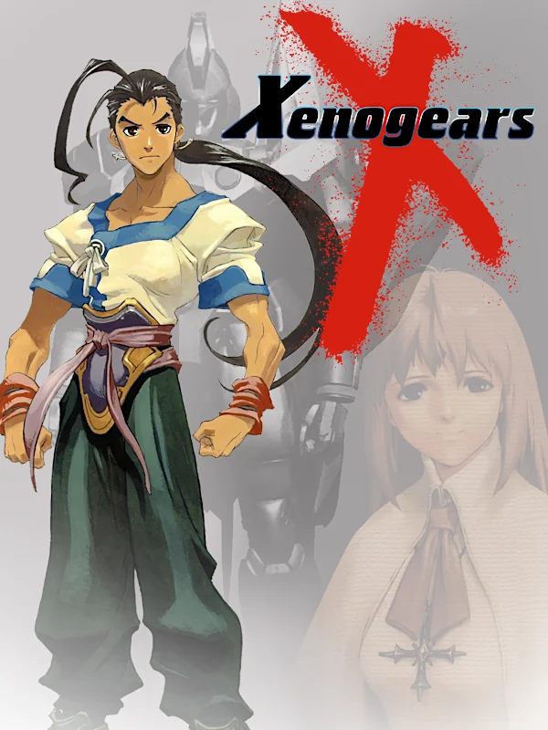
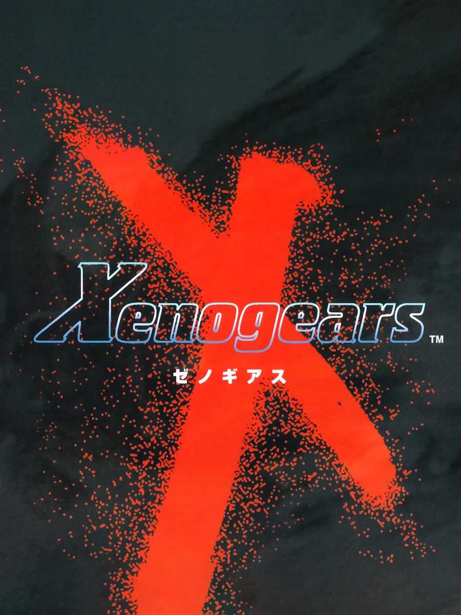
Japan's box is black, with a huge red X painted across it in a single violent stroke. The American box, on the other hand, shows the hero Fei standing in front of a faded portrait, which is fine but forgettable next to that X.
5. Metal Gear Solid (1998)

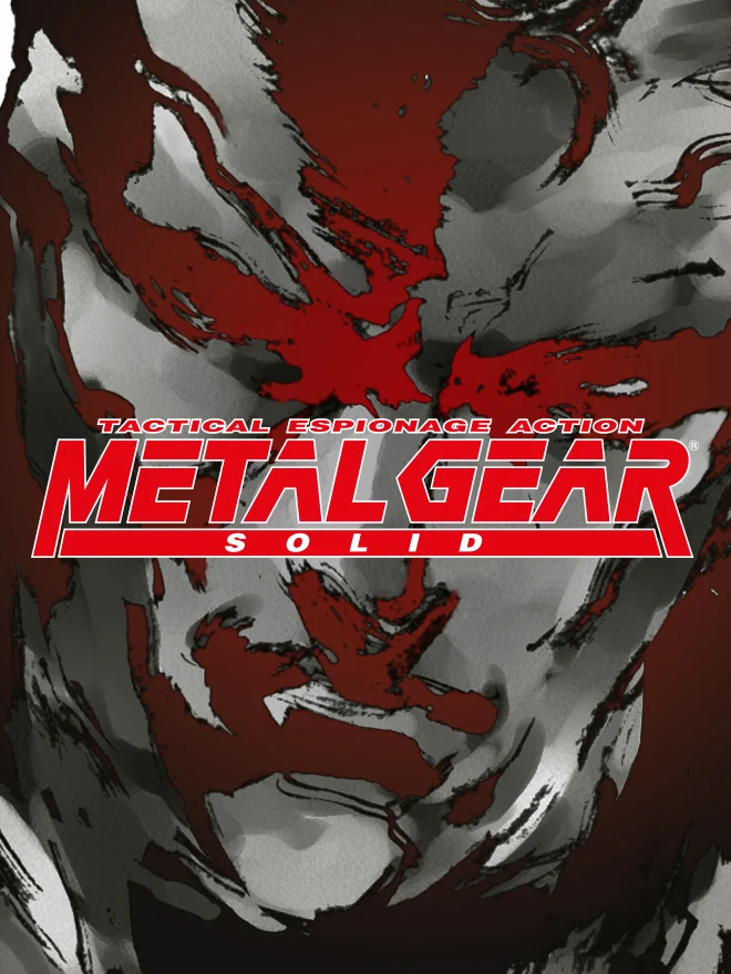
The American box is almost entirely white, with just the red logo in the middle. Confident, to say the least. Europe went the other way and covered the box in a red and grey ink painting, so dark and messy that the logo seems to bleed out of it.
4. Silent Hill (1999)
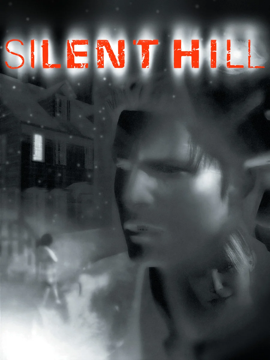
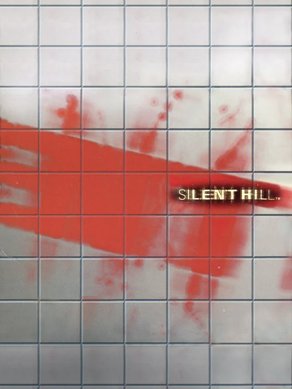
Japan's box is a wall of white tiles with a long smear of red across it, and the small logo tucked in the corner. It looks like a bathroom after something terrible happened. The American box, by comparison, is a blurry grey face, which is creepy but much less clever.
3. Vib-Ribbon (1999)
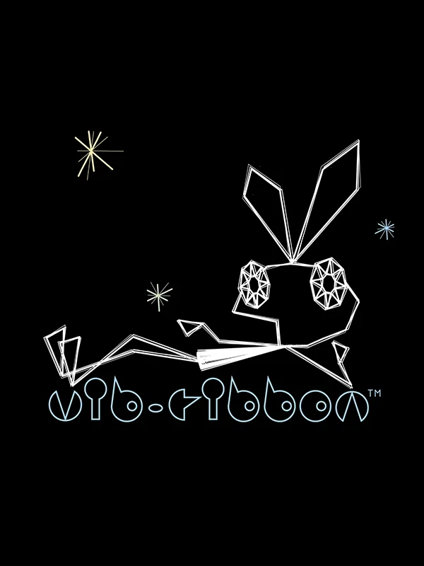
A white rabbit drawn from a few straight lines sits on a black box, with the logo written in the same thin line underneath. That is the entire cover, and it matches the game, whose graphics are made of straight white vector lines too.
2. Moon: Remix RPG Adventure (1997)
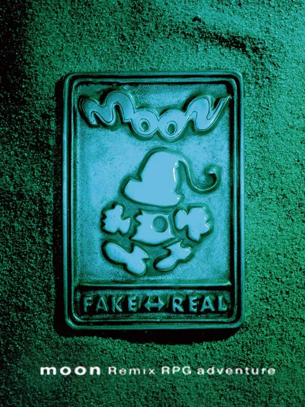
The whole box is a teal tile with a small embossed figure in the middle and the words Fake and Real underneath. It is unsettling in a quiet way, and it fits a game that drops the battles and levelling of the average RPG. Its studio only ever released Japanese exclusives, so very few players outside Japan saw this box on a shelf.
1. Castlevania: Symphony of the Night (1997)
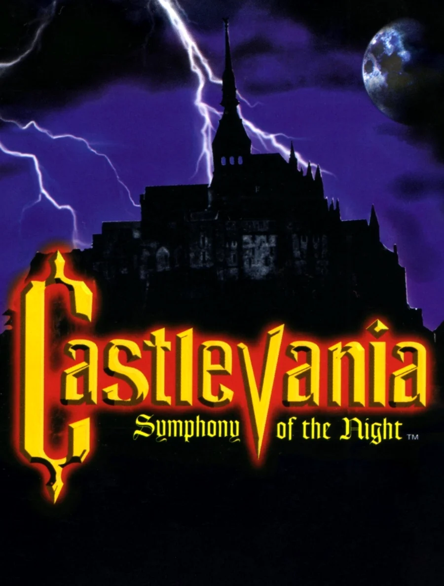
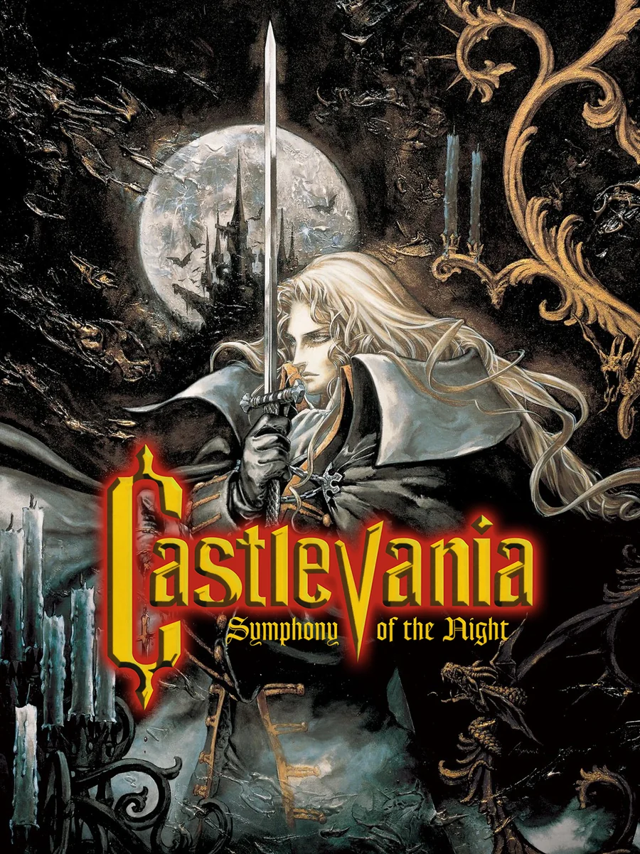
The American box shows a castle under a lightning storm with a gaudy yellow logo, like a horror film on late-night TV. Europe and Japan, however, got Alucard himself, painted in pale gold and grey with his long white hair falling over his cloak. The game marked the debut of the artist Ayami Kojima, and that European cover is one of the most beautiful boxes the system ever had.
The other side of the shelf: the worst PS1 box art.