The Game Boy Advance had some of the best handheld games ever made. Some of them, and plenty of the others, came in these boxes.
10. Crazy Frog Racer (2006)
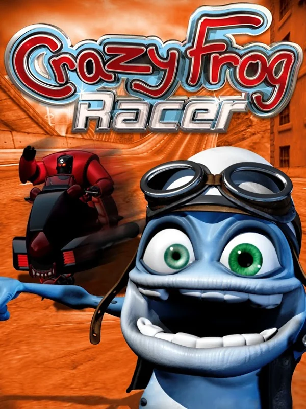
The Crazy Frog grins out of the box in a leather flying helmet, bug-eyed and far too close, against a hot orange road. Nobody who bought it was confused about what they were getting, and that is the problem.
9. Ice Nine (2005)
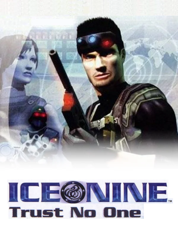
A man in a headset holds a gun next to a woman fading into a blue haze, under the tagline Trust No One. It looks like the poster for a TV thriller you have never heard of, and the white space at the bottom does not help.
8. Board Game Classics (2005)
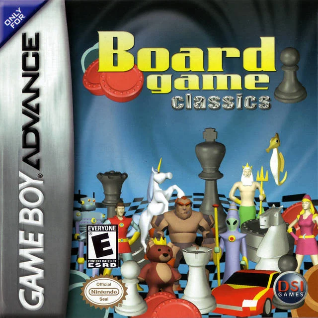
Chess pieces, a teddy bear, a red toy car and a unicorn are piled onto a blue box with no sense of order. It looks like somebody emptied a toy chest onto a scanner. In fairness, that is roughly what the game is.
7. Banjo-Pilot (2005)
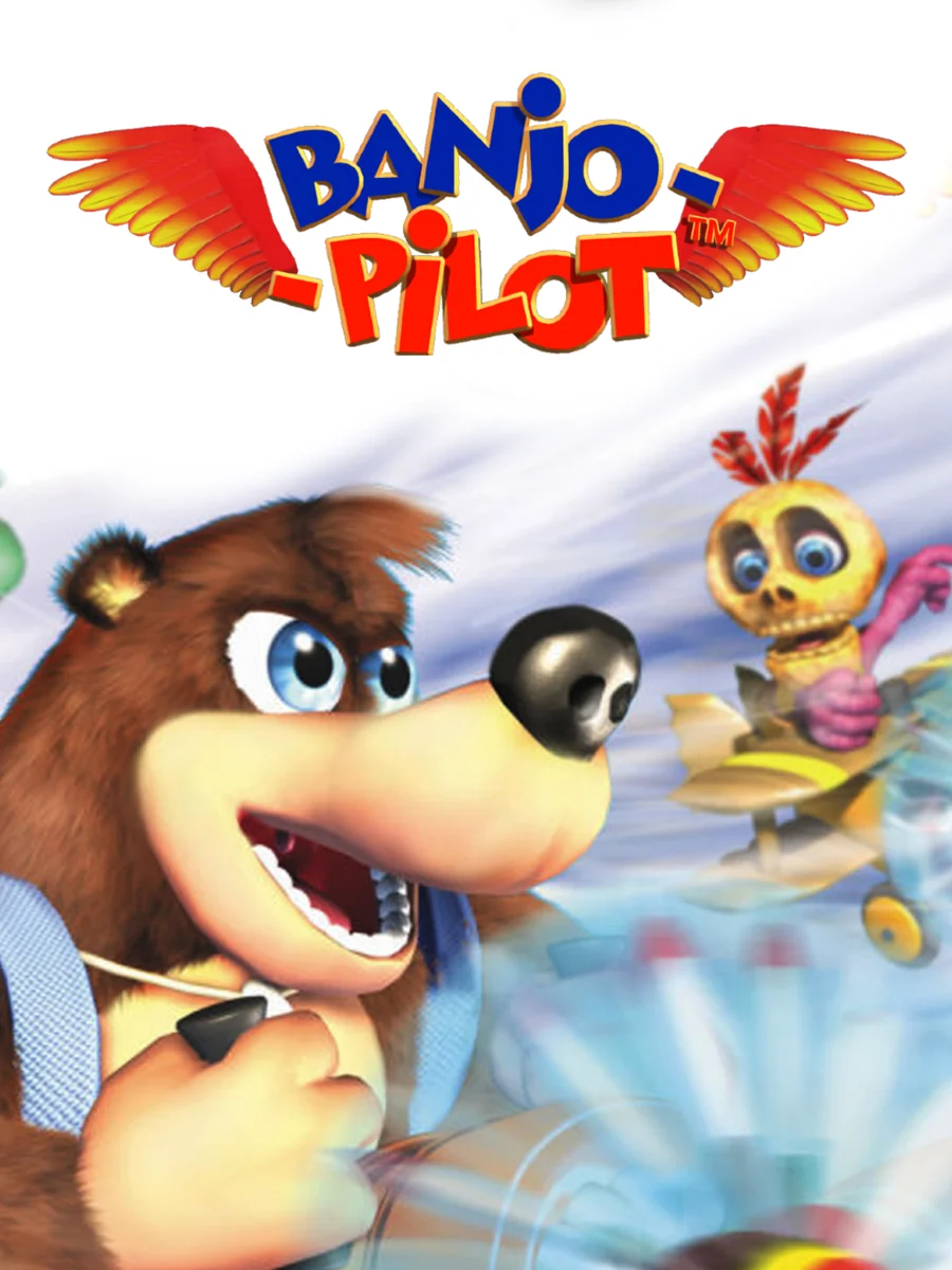
Banjo's face is cropped off at the edge of the box while a wide-eyed bird flies past behind him. The game had a rough life before this, too: it was announced as Diddy Kong Pilot and only later retooled with characters from the Banjo series.
6. Rebelstar: Tactical Command (2005)
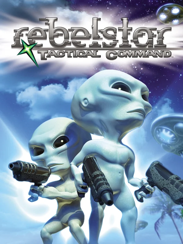
Pale grey aliens point big guns at nothing in particular, rendered in early 3D and washed out in blue. That is a real shame, because the game was created by Julian Gollop, who designed UFO: Enemy Unknown, and deserved a far sharper cover.
5. Payback (2001)
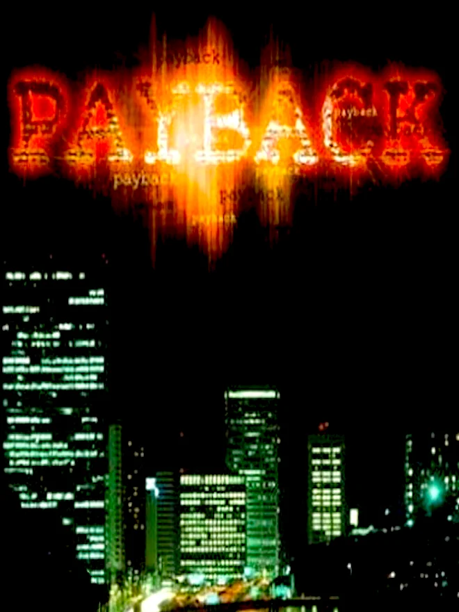
A city at night sits at the bottom of a black box, under a title that looks like it is on fire and out of focus. There is no character in sight and no hint of what you actually do.
4. ESPN Final Round Golf 2002 (2001)
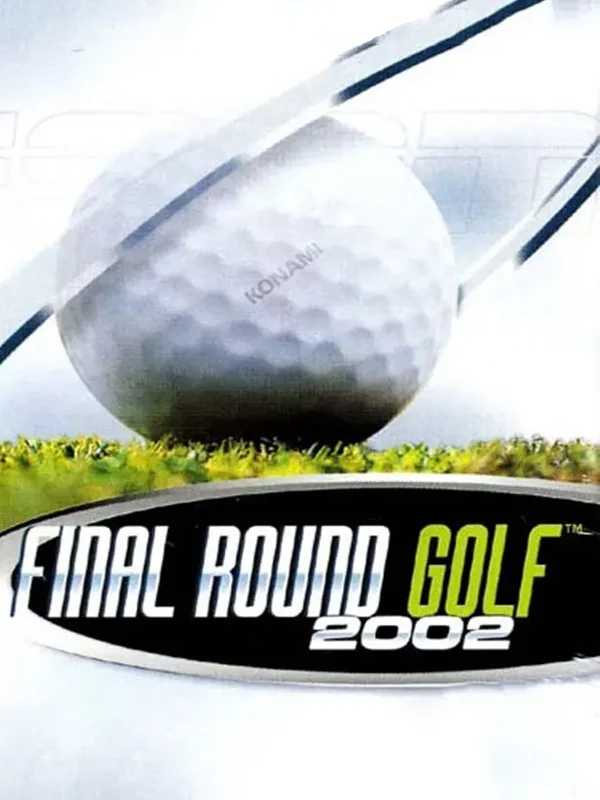
A golf ball sits on a tee against a white sky, and that is the entire cover. Does it say golf? Absolutely. Does it say anything else? Not even slightly.
3. Gekido Advance: Kintaro's Revenge (2002)
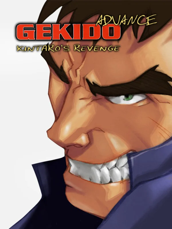
A giant face with a gritted grin is cropped so tight that you only get one eye and a mouthful of teeth. It is meant to look tough, but cropped this tight it mostly looks uncomfortable.
2. Sheep (2002)
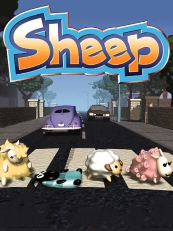
A row of lumpy 3D sheep cross a zebra crossing while cars wait behind them on a suburban street. It looks like a nod to a famous album cover, but the render is so stiff that the joke never lands.
1. Castlevania Double Pack (2006)
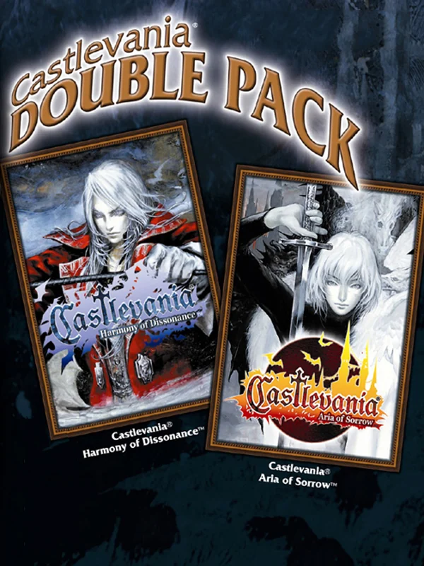
Two of the most beautiful covers on the system, Harmony of Dissonance and Aria of Sorrow, are shrunk into little frames on a brown wallpaper, as if they were hanging in a dusty hallway. In other words, the box looks more like a print ad than the full cover art of either game. That may even be part of why the pack is cheaper than a complete copy of Aria on its own.
The covers that got it right: the best Game Boy Advance box art.